In the previous articles such as the making of a magazine cover and the standards and design guidelines, focused on the elements as well as the technical side of crafting magazines. But with all those comprehensions on the basics, without the proper imprint of who your readers are might render that pivotal mastery ineffective. Which we will discuss as the link the previously mentioned topics pertaining to magazines.
In our list down below, we have gathered tips and tricks important for magazines to help you get by in market segmentation as well as leveling up the design and technical elements for your magazines. For more creative inspirations, we have collected essential magazines that serves up artistic artworks and design topics to get you in the know about art and design.
Begin with the essentials.
Before anything else, you must ask yourself who this magazine is for. Having such comprehension towards your target audience is a pre-requisite to moving around with potential themes and concepts. As well as being able to move forward and be able to propel the core of the brand and magazine to a wider reach and increase frequency.
Get to know your target audience.
Demographics
Demographics are the characteristics of the human population. It involves asking the age, gender, and status of a potential target audience and prospects. The list for the demographics involves:
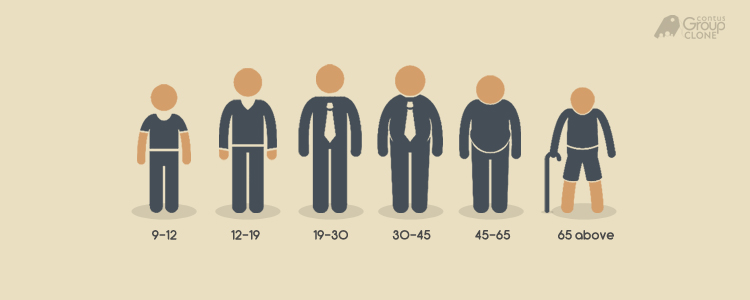
Age: It is best to cover a limited range in terms of the age groups unless your target audience is the general mass; which doesn’t necessarily have a specific niche. In design, a theory is followed that in thousands of people that are targeted for an advertisement, most likely, only hundreds would be affected and will receive high-impact on the advertisement’s message.
Age group example courtesy of Group Clone
In this case, magazines such as Vogue separate their age groups through different magazines thus conceiving Teen Vogue magazine. Reader’s Digest, on the other hand, also produces international editions of their own general-interest family magazine. Its line up of international distribution includes Asia, Canada, India, Australia and so on.
Vogue Magazine Cover courtesy of Vogue Australia
Model: Chance the Rapper / Vogue Magazine Cover courtesy of Teen Vogue
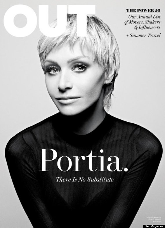
Gender: Will this publication of seasonal information be targeted towards females or male? For a more specific selection for this segment, will this magazine be for the LGBTQ youth, queer individuals, drag queens and kings and so on? Addressing a specific decision would guarantee a breeze when it comes to the planning, designing and production processes.
Model: Rupaul / Paper Magazine Cover courtesy of The WOW Report
Model: Portia De Rossi / Out Magazine Cover courtesy of Hufftington Post
Educational Status: Are you targeting your magazine towards middle schoolers or college graduates? Maybe undergraduates or master’s degree holders? Be specific in mentioning their educational status or at least mention the closest to the demographic or target audience.
You may also go through our list of design tips to incorporate into college magazines.
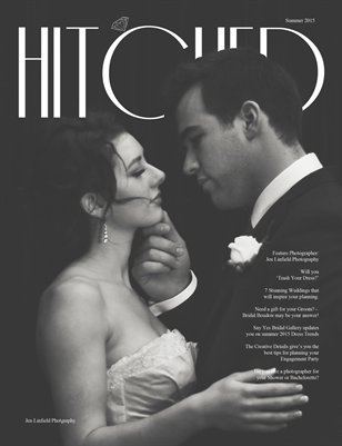
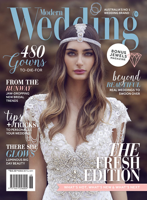
Marital Status: Are your potential prospects single, engaged or married? Much like wedding related magazines pertains to those individuals who are engaged and in a few blocks away from specific target audience it could also be for fashion designers, wedding planners and fashion houses and boutiques.
There are an array of magazines targeted towards single individuals with topics that range from beauty, lifestyle, technology and so on.
Hitched Magazine Cover courtesy of MagCloud
Modern Wedding Magazine Cover courtesy of Modern Wedding
Social Class: In an objective manner, are your probable prospects in the middle class, below or above middle class? This is where you may clarify if your magazine is for the masses or for the general audience. This will determine the fitting theme or topics to mention in the glossy.
Sunstar Cover courtesy of Sunstar
Income (if necessary): As mentioned previously, for this category, decide in an objective manner in determining your potential readers’ income. This category can help you direct your budget, design as well as the topics to be written and featured.
Psychographics:
On the flip side to demographics, psychographics dwells more about the study of people in regards to their aspirations, psychological criteria and so on. For this category, involves a lineup questions one must have to ask be it for design, marketing, advertisements and in this case, magazines.
Lifestyle: Does your target audience enjoy high or low adventure activities? If either one, be specific with which types of activities and mention all that closely resemble your target audience.
Personality: Are they outgoing, carefree and chill or probably the flip side. Probably more traditional than its counterpart? Personalities are complex and there are individuals who may possess either or both. So, mention as many that suggest the personality of your potential prospects.
Interests: Does fashion, art, design, housekeeping, history or politics and so on spark their interest? If so, incorporate those details unwaveringly in this category.
Values: What do they believe in, in terms of spiritual level, environmental, technological and so on. For example, does your potential target market value the use of environmentally friendly products and resistance in animal cruelty? You may start with such example and apply your own determining values possessed by your audience.
Geographics:
Where would your likely readers be in terms of location? Having a grasp on your target audience’s geographics will be of great advantage in terms of conveying the magazine’s message, readers statistics and more importantly close the deal in the market segmentation.
Urban or Rural: Which potential prospects to target in terms of location or residence? Do they reside in the urban or rural scene and if either so, how may you distribute your glossies to the designated locations? As mentioned above, be specific and accurate with this segment.
Country or State: Yes, this segment is crucial in terms of readership statistics as well as the distribution of the printed materials. As well as the comprehension of the standards, culture, and the subcultures of the specific country or state.
International Distribution Magazine Cover courtesy of Reader’s Digest
In regards to Magazine covers.
Play around with the masthead.
Who says mastheads should always be placed on top where you may place it elsewhere to add some contrast as well as infuse the current theme or concept. Different design techniques allow magazines to change and amp up their magazine cover design without terminating the familiarity of their brand.
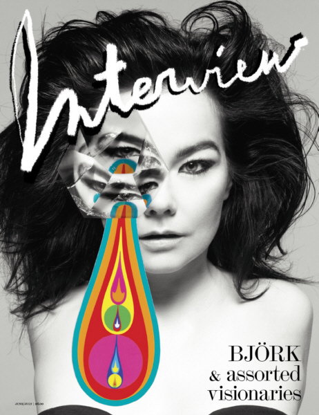
Masthead example courtesy of Dazed & Confused
Masthead example courtesy of starmometer.com
Masthead example courtesy of Pinterest
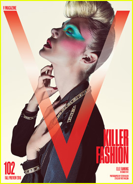
Masthead example courtesy of V Magazine
Masthead example courtesy of shoppersshop.com
Black magazine covers do sell.
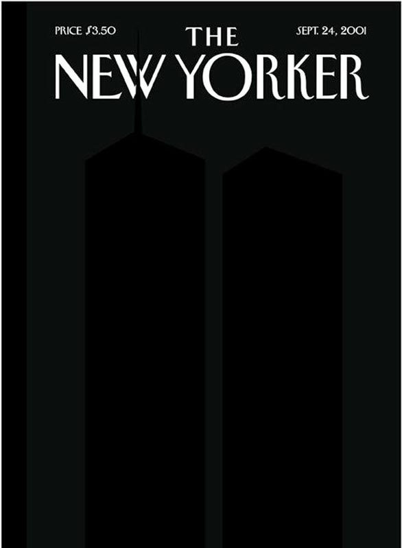
Bright pops of color grab one’s attention with their exciting and upbeat characteristic. But even neutrals and in this case, black can translate modernity, sleekness, and class to a magazine cover and overall layout. Black is a neutral that is perfect for various themes and demographics. You may also mix in black with other pops of color; one of the favorites are black paired pink, yellow and even the classic and pure white.
Black Colored Magazine Cover example courtesy of The New Yorker
Black Colored Magazine Cover example courtesy of magazinedesigning.com
Black Colored Magazine Cover example courtesy of bellanaija.com
Black Colored Magazine Cover example courtesy of magzter.com
Different color for every issue published.
Magazine covers, as well as the inside of the glossy, are treated with variety and changes of color. As themes and topics differ every issue or season, the concept and color treatment does the same. This is to give a distinction in quality and characteristic without having to terminate the familiarity of the magazine’s branding.
Main color example courtesy of Today’s CAROLINIAN
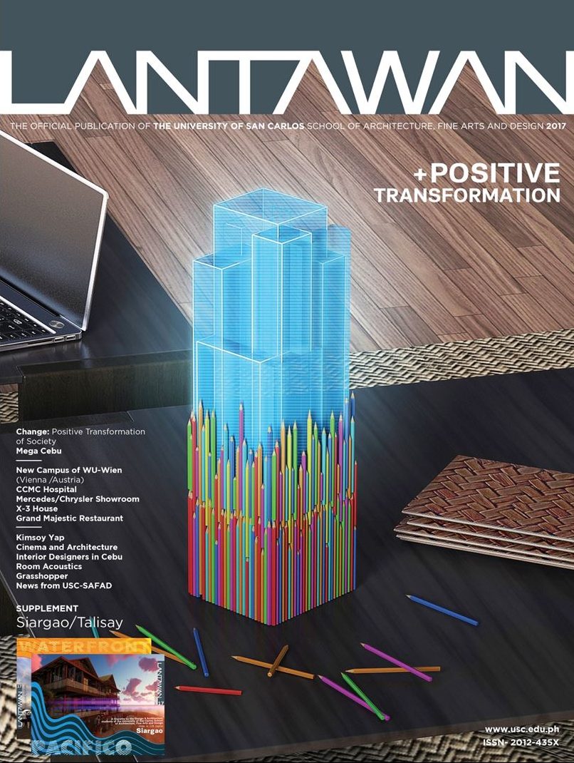
Main color example courtesy of University of San Carlos
Main color example courtesy of biascoarchitects
Main color example courtesy of kdaawnsky.blogspot.com
Main color example courtesy of University of San Carlos
In regards to Cover Lines.
Use clear word play. Make sure that your cover lines are understandable and offers wit or at least entice readers to browse through the glossy to read the article/s.
Ask a question and give an answer. Don’t let your readers be hanging and left questioning to what the exact answer is for your question.
Cover lines don’t necessarily have to be the biggest article. Aside from the main cover line, the rest of the cover lines should be treated well with its composition, layout as well as word play.
It’s okay to repeat cover lines especially when it is catchy and is a classic stay. At least repeat it on the upcoming articles and when it fits and is appropriate.
Use descriptive words. We say, entice your readers to the content they might be missing out on. While going technical is mighty fine but in some cases, the use of descriptive words does the job.
For the next part of our series in regards to magazines, we have prepared a collection of brilliant design techniques applied from various glossies and to inspire your creative eye. These heap of magazine design techniques will be of great help for design projects and may be utilized for future references.
Related Posts
FREE The Structure of a Magazine
Design: The Making of a Magazine Cover
FREE 20+ Elegant Electronics Magazine Designs
FREE 21+ Christmas Clip arts in Vector EPS | AI
FREE 14+ Christmas Backgrounds in PSD | AI | Vector EPS
FREE 20 A4 Paper Mockups in PSD | InDesign | AI
FREE 22+ Technology Brochure Templates in PSD | Vector EPS | InDesign | MS Word | Pages | Publisher | AI
FREE 22 High Quality Blue Textures for Graphic Designers in PSD | Vector EPS
FREE 21 Blue Pattern Backgrounds in PSD | AI
FREE 21 PSD Vintage Logo Designs in PSD | Vector EPS
FREE 22 White Paper Texture Designs in PSD | Vector EPS
FREE 30 Square Brochure Mockups in PSD | InDesign | AI
FREE 24 Envelope Mockups in PSD | InDesign | AI | Stationery
FREE 29+ PSD Christmas Invitation Card Designs in PSD | MS Word | AI | Apple Pages | Publisher
FREE 20 Silver Texture Designs in PSD | Vector EPS
