
As what we have mentioned in the previous articles such as the makings of a magazine cover and the standards and design guidelines, all of which follows a structure to complete its overall design & layout and so does the magazine. These days, magazines follow the same structure with an exception of some publications that may not follow the exact approach.
Down below, we have listed the default structure that most publications employ. This would take you to the four parts namely cover pages, front of the book, feature pages, and back of the book. You may also view our heap of tips and tricks in crafting high-impact magazines.
The Default Structure of the Magazine.
Generally, most magazines divide its structure into two namely Creative engine and Business function. The latter is designated for advertising, while the creative engine is for editorial and arts. But on a broader scale, magazines consists of four parts: Cover pages, front of the book, feature well and the back of the book. Skim through the list down below and let us break down each of the parts that complete a magazine.
Cover Pages.
Flip the page and you’ll arrive first at the cover pages. The latter is reserved for advertising which is separated by the cost of the page. The first cover is the cover page. The second alternate to the cover page is reserved for advertising which is the second most expensive advertisement page in the magazine.
Next in line, the third cover page, still reserved for advertisers which is less expensive than its predecessor. Lastly, the cover page at the back of the magazine counts as the most expensive advertisement page.
Front of the Book.
Table of Contents is the first in appearance in the magazine. The table of contents may be placed on a single page, two page spread or on two separate pages intersected with the ads.
In designing the table of contents, you may incorporate images to allow readers visualize the article at hand. By doing so, it adds distinction to the table of content elements. The use of typographic choice will be of good use in this segment.
Examples on Table of Contents
Rage On Magazine

Photo Courtesy of Nate Hinners
Lantawan Magazine
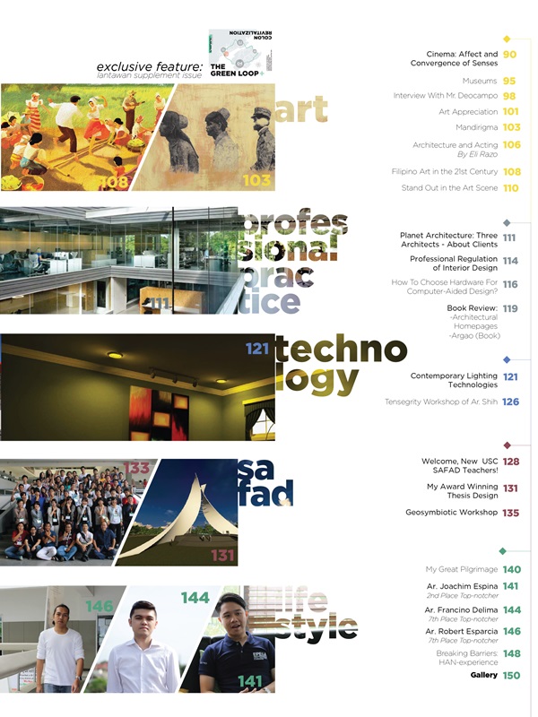
Lantawan Magazine: 2016 Convergence Issue / Photo Courtesy of University of San Carlos
Impressum. To put it simply, this segment is the list of all the people that worked for the magazine. Be it the editorial staff, marketing, advertisements, publishers and other key people in making the magazine possible.
The Impressum is usually placed in the front of the book and in some cases, are placed at the back of the magazine. The design for the Impressum is direct and clean with the placement of the logo placed atop of the page.
Example on Impressum.
Grow Magazine
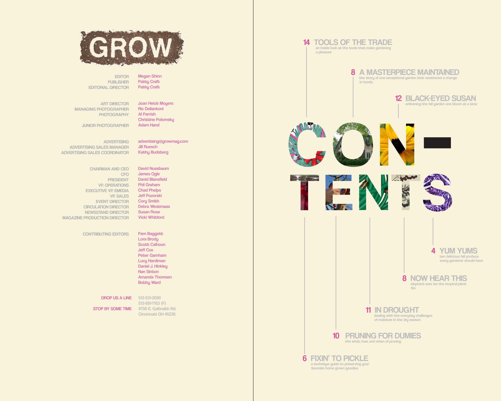
Impressum & Table of Contents example/ Grow Magazine / Photo Courtesy of Toni Rogers
Letter from the Editor. The editor’s letter serves as the first editorial page in the magazine and it brings about a welcoming letter from the editor itself. This segment also explains the content of the magazine. It also includes any thoughts, inspirations, and events that occurred prior to the magazine’s issue date.
The editor’s letter should also be treated well in terms of layout and design. Most magazines place images of the production shoots, featured articles and so on to add in some visuals for this certain segment. Since the editor’s letter serves as the first editorial page, it is nice to start with strengthening your layout with the use of layout.
Examples of the Letter From the Editor.
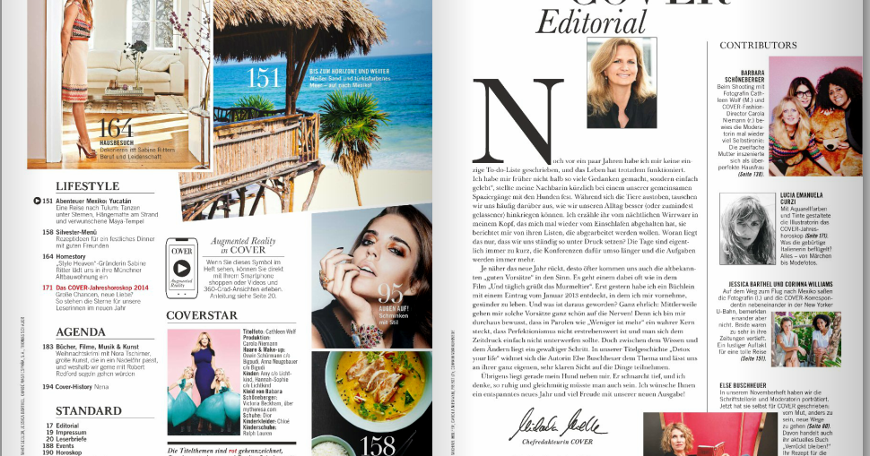
Zee Lifestyle Magazine

Zee Lifestyle Magazine July 2016 Issue / Photo Courtesy of talentman
Other Key Pages. It is likely to start with short one page topics before flipping to the featured or main stories. If this was a mean, these key pages serve as an appetizer. The key pages can contain topics pertaining to culture, arts, events and so on.
Key pages also contain short page interviews and columns. In some magazines, the key pages are intersected with ad pages to provide flow and tiny breaks in between. Which is a smart move since the next segment, the feature well, is pages sans of any advertisements.
Reader’s Digest, for example, uses the same flow with its pagination. The magazine’s key pages contain light-hearted stories, household topics, medically related themes and so on fitted in between one or three pages.
Examples on Key Pages.
Reader’s Digest
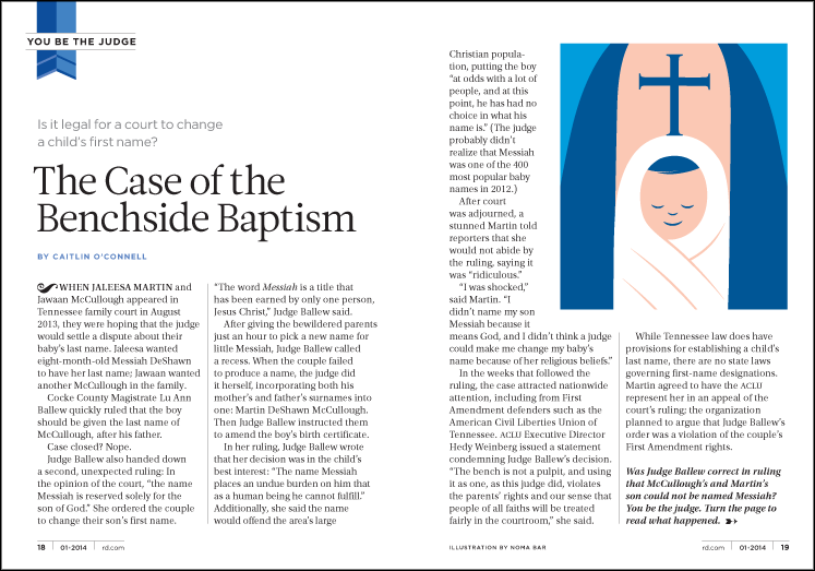
Reader’s Digest / Photo Courtesy of Zinio Digital Magazines & Books
Reader’s Digest / Photo Courtesy of Zinio Digital Magazines & Books
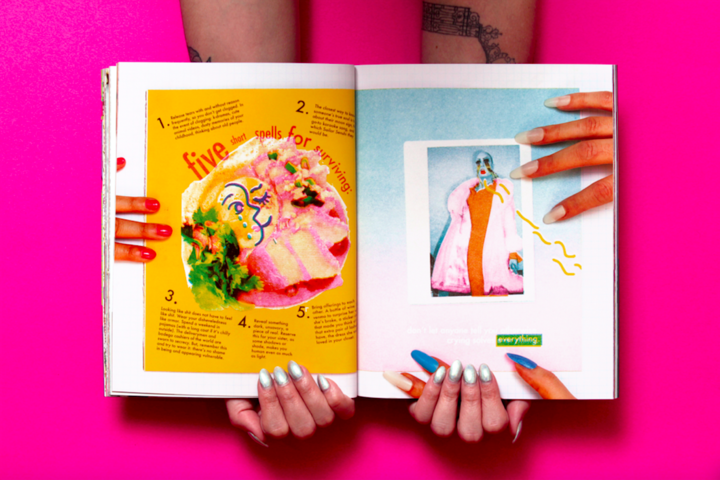
Feature Well.
The feature well takes up much space in the magazine since it contains the main features. The latter and articles may include short or long content or features spanning five or more pages.
In terms of the placement of the featured stories, it would be better to follow a lengthy article with a short one. By doing so, gives some flow to the magazine. For example, an eight spread article could be followed by a three or two-page feature.
For the features, incorporate variety to avoid confusion of the length of the article. Apply the different layout techniques and styles to add in some splash and create an interesting exterior. The use of columns can greatly help in strengthening a page and layout.
Examples of Feature Well.
Velour: The Drag Magazine
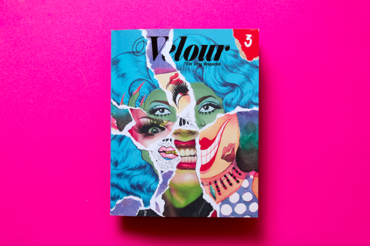
Velour: The Drag Magazine – Issue #3 Sister, Sister / Photo Courtesy of Huffington Post

Velour: The Drag Magazine – Issue #3 Sister, Sister / Photo Courtesy of Huffington Post
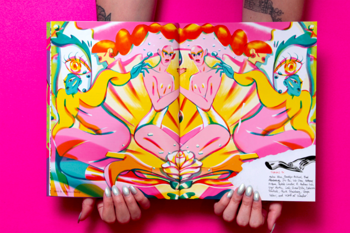
Velour: The Drag Magazine – Issue #3 Sister, Sister / Photo Courtesy of Huffington Post
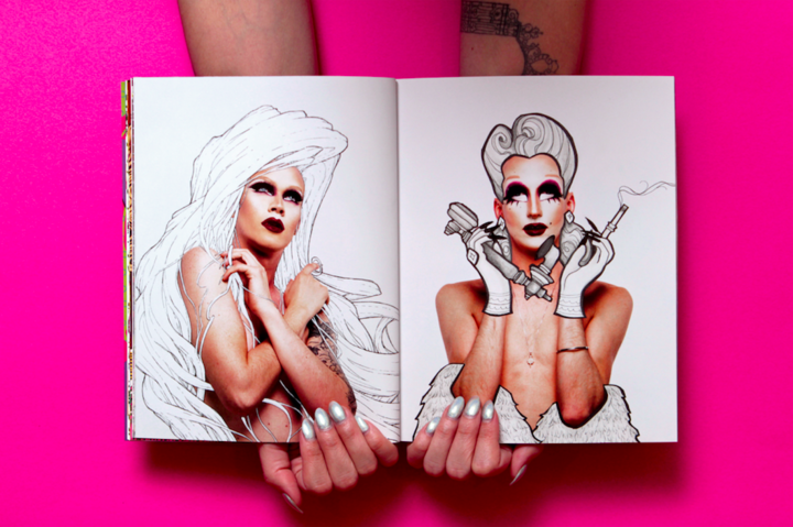
Velour: The Drag Magazine – Issue #3 Sister, Sister / Photo Courtesy of Huffington Post
Velour: The Drag Magazine – Issue #3 Sister, Sister / Photo Courtesy of Huffington Post
Back of the book.
The back of the book accommodates the remaining content from the front of the magazine such as short articles, horoscopes and so on. Do resist to put less importance on this segment since this serves as the conclusion of the magazine’s content.
Advertisement placement in this segment is cheaper and can be set with classified ads; which depends on the nature or core of the magazine.
Tell me more!
Placement of the advertisements.
Advertisers prefer that the advertisements are to be placed on the right side of the magazine. Stating that this placement allows their ads to be clearly visible than the left-hand pages.
Design elements for the advertisements.
In terms of advertisements, you may freely design your ads with fewer constraints. This is due to the good quality of paper and material used to produce magazines and the availability of space for ad placements. For the typographic elements, you may apply delicate scripts and medium to fine type since the design would not be disrupted once produced. In terms of images, you may apply full-colored graphics, illustrations or images. Just keep in mind to add some bleeds and margins.
Before we call it a day
With the technical and design processes mentioned in our previous articles regarding magazines, we must talk about the design treatment applied on various magazines. To help you get by, we have gathered impressive and truly authentic design techniques styled on an array of magazine covers. You may apply them for design projects at hand and as future references. We hope that this of great help to you.
Related Posts
21+ Digital Photography Magazines - PSD, Vector EPS, JPG ...
21+ News Magazines - PSD, Vector EPS, JPG Download ...
20+ Technology Magazine Designs - PSD, Vector EPS, JPG ...
20+ Tourism Magazine Designs - PSD, Vector EPS, PSD, AI Download
16 Free Online Magazine Makers
Free PSD Magazine Ad Mockups
Magazines: Standards and Design Guidelines
Electronic Magazines
Tips & Tricks on Crafting High-Impact Magazines
Design: Introduction to Magazine Covers
10+ Tips For College Magazine Designs
20+ Corporate Magazine Designs - PSD, Vector EPS, JPG ...
10+ Magazine Mockups - PSD, Indesign, AI Format Download
Inspiration