Flyers are one of the most versatile affordable means of advertising and marketing materials. This is one good way of giving exposure to your brand, thus, creating awareness to your potential prospects. Flyers are lightweight, practical for production and increases reach towards the designated target market.With all those beautiful and broad utilization of flyers, you must need to incorporate a great design.
Down below, we have listed a comprehensive guide on both the technical and creative processes of designing a flyer. We also gathered impressive flyer designs just right to inspire your creative eye.
Speaking of flyers, we have more in store for your design needs. You may go through our heap of karaoke flyer designs that are inviting as well as exciting.
When Designing A Flyer…
Designing a flyer isn’t as easy as whistling. There are creative constraints you have to keep in mind such as allowed budget, production, target market and design. Though this won’t limit the creativity to be poured on to the designs, this will help you in starting as well as incorporating important details for your flyer design.
Target Market
Demographics. First, determine your demographics: do they belong to the youth category, working class, are they middle aged individuals? You must be specific and less broad in terms of age, unless, your brand or flyer is fit for the masses.
Psychographics. You must answer the questions regarding your target market’s lifestyle and personality. This will help in determining the target market’s purchase decision, what they need and how much willingness will they have in buying your product or in going to your event.
Geographics. In handing out your flyers, where does your target market usually reside or visit? It can be in schools, malls, stalls and kiosks, corporate buildings, and so on.
On the Technical Side
Paper sizes that work for flyers. Know which paper size to use. Is it going to be lengthwise or crosswise? That is one creative constraint to be mindful of but in terms of production, we should be more specific.
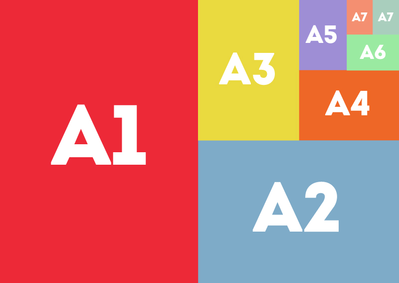
The most commonly used is the standard letter size which measures up to 8.5×11. The readily available paper size is A4 which measures up to 8.3×11.7 in. Which you may also cut in halves to increase the quantity of the flyers. The A5 paper size is also a practical choice but it is smaller than the two previously mentioned; it measures up to 5.8×8.3in. A7 is also commonly used for flyers which result to a postcard size. You can cut the A5 into fours to receive four A7 paper sizes.
Also, keep in mind to be specific when it comes to sizes. Re-sizing your flyers during the printing process will delay the production, as well as the design of the flyers, will be altered either resulting to a stretched or distorted appearance. You may also go through our list of A4 flyer mockups that will be helpful for presentations.
Paper Size Chart courtesy of attitudedesign.co.uk
Keep in mind which material to use. For printed flyers, you have a variety of options to use for paper materials. Clients or customers might have to depend on the availability of the paper materials in printing services. But choosing the right material for your flyer is necessary.
Flyers filled with images or dominating most of the space might go well with laser printing or inkjets printed on a smooth or glossy papers. While a hard or thicker paper materials might compromise the images and text. Go and get through the paper materials available at your trusted printing services for an extensive selection.
How many flyers to produce. How many will you need to hand out?
The Essentials Needed in a Flyer Design
Logo. A staple for every flyer design. Keep in mind not to leave this behind since this will be a visual reminder of the brand or company launching such product or event.
Event name. Let it be known what you are celebrating for whether it is a sales promotion or event.
Headline. This is your introduction to grab the recipient’s attention on what the product or event is or will be for.
Copy. Back up your headline with a convincing and extensive copy regarding what you are presenting in the flyer.
Event details. The following event details are as follows: date, time, locale, theme and motif (if necessary).
Call to action are technical elements for an immediate response from the recipient such as social media, contact information and phrases like “For a limited time only!” or “Get one now!”
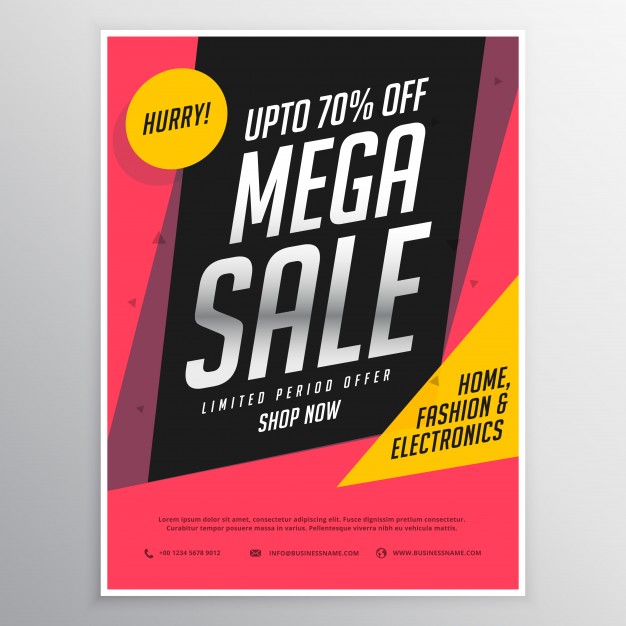
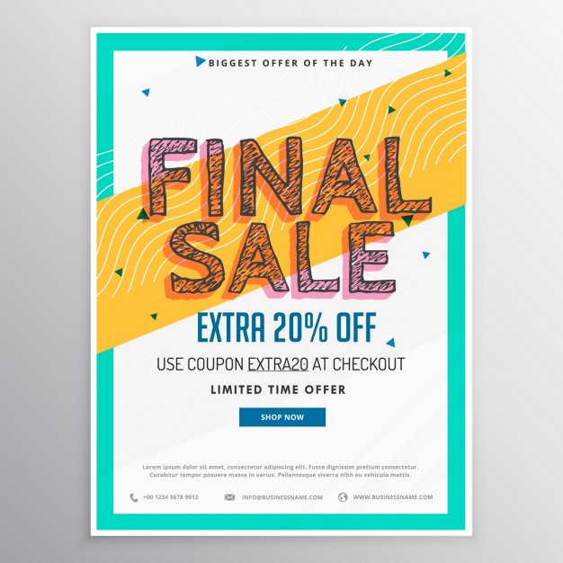
For example, the Super Offers Flyers directly below incorporates most of the essentials as well as attention grabbing design elements.
Super Offers Flyers
In the Process of a Flyer Design
Place your logo where it is visible yet it doesn’t overpower the rest of the design elements. Place emphasis on this visual which is usually placed on top be it aligned center or on either side. When you’re designing a brand or an event’s flyer, keep in mind to refer to a brand or company’s brand guide in properly incorporating the logo.
To get a hold on more about the proper application of brand logos, you may go through our comprehensive aid on brand guides to gain insight on the essentials needed and find creative inspiration from the gathered brand guides across various brands.
Don’t leave behind any details. Whether it is for an event, sales promotions and so on, the details such as date, time and locale are strongly important. Keep in mind to place it somewhere it isn’t crammed and as much as possible write these details down in readable font or typeface.
Call to action are technical elements that ensure immediate response or communication towards your potential prospect or recipient. Call to action elements are as follows: social media accounts, websites and more importantly phrases such as “Visit a store today!”, “Call now.” or “Buy now! Until supplies last.”
Place the lineup of sponsors neatly. This gives proper exposure as well as clear visual towards the partnership with your brand and the sponsors. Similar with the proper logo placement mentioned above, keep in mind to place the sponsor’s logo in a less decorated space or separate from the photo to avoid confusion as well as improper utilization of logo.
An Array of Flyer Design Examples
Directly below, we have gathered flyer design examples that feature music festival, sales promotions, discount vouchers and downloadable samples that you may apply for design projects, presentations and for future references. All are of varying designs to match its purpose and theme as well as takes keen take on application of the design elements.
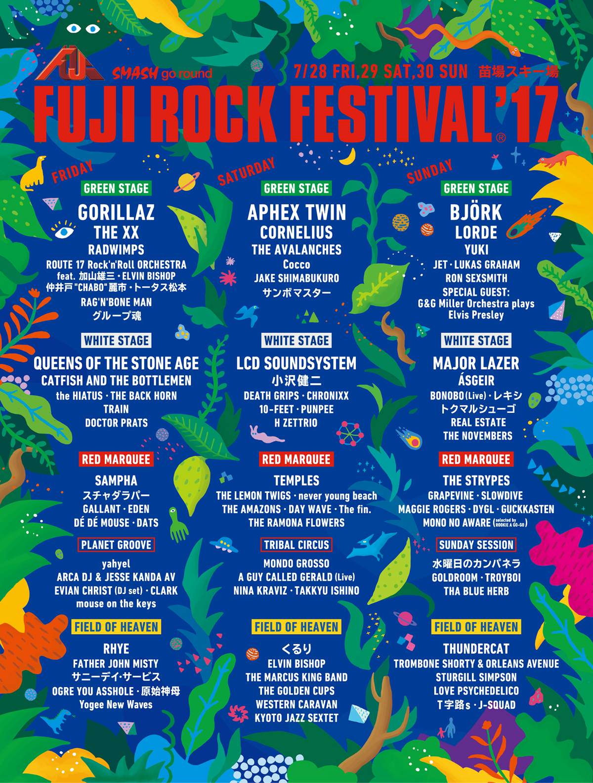
FUJI Rock Festival 2017
As you can see, the text isn’t placed on a busy background to give emphasis on the text as well as giving way to readability. The color palette used is dominant in receding colors which is well contrasted by pops of bright colors as well as white for the text. The type of layout also gives harmony to the viewer’s direction in terms of reading through the text. The over-all theme is dedicated to a younger audience, hence, the digital illustration creative direction.
Space Galactic Flyer
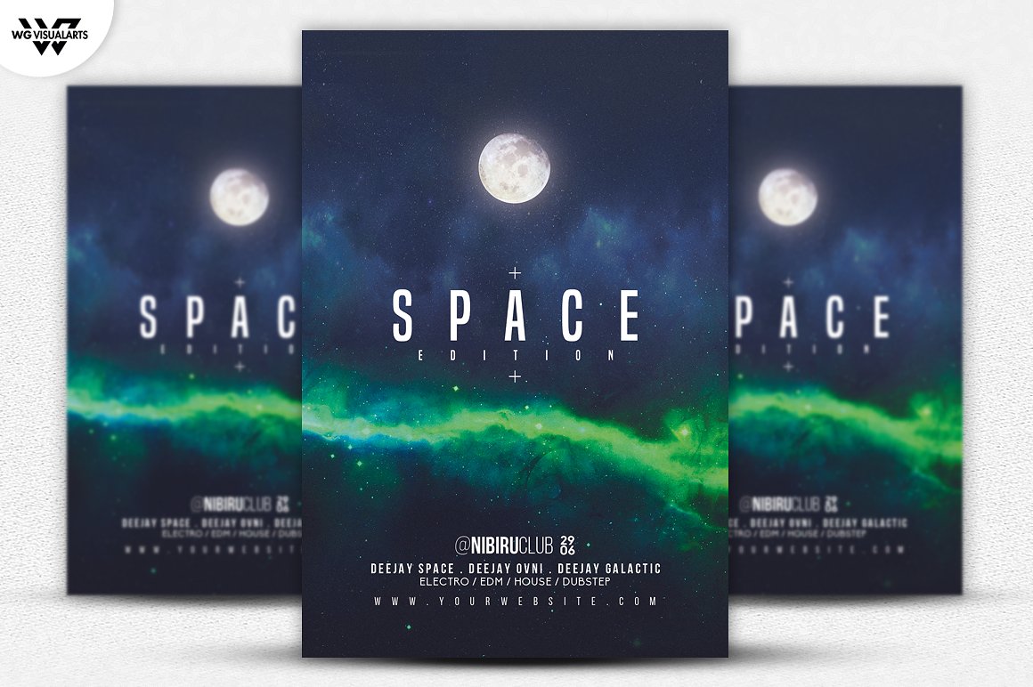
This type of flyer demonstrates a minimal design style with its space and galactic theme. It takes a direct approach in conveying its message. If you are looking for such practicality and features, this might be the flyer to consider. It is available in a high-resolution file format in 300dpi. This set of galactic flyer is fully customizable with organized layers. It is already set in a CMYK color mode which it is print ready.
Summer Tropical Themed Flyer
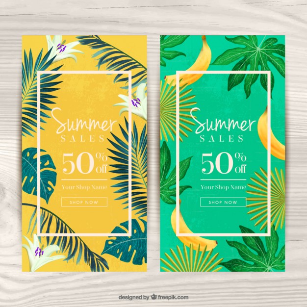
This type of flyer offers a simple and minimal layout with a complementary color palette. The fonts used in this flyer, fine and serif fonts, pairs well with each other. The creative direction takes to a modern and detailed illustration. Also, it is good to note that the type of layout used in this flyer design incorporates a frame type layout which encloses the elements inside a shape or mask.
Fashion Week I Modern and Creative Templates Suites
The way to visualize this flyer design is the simplicity of the introduction and directing you to an exciting emotion through the use of explosive colors and shapes. It is attention grabbing as well as unconventional which works in favor of the brand. It simply translates surprises and excitement that you just can’t miss. It may have an irregular composition in terms of text but gives this proper direction as to imprinting the technical elements.
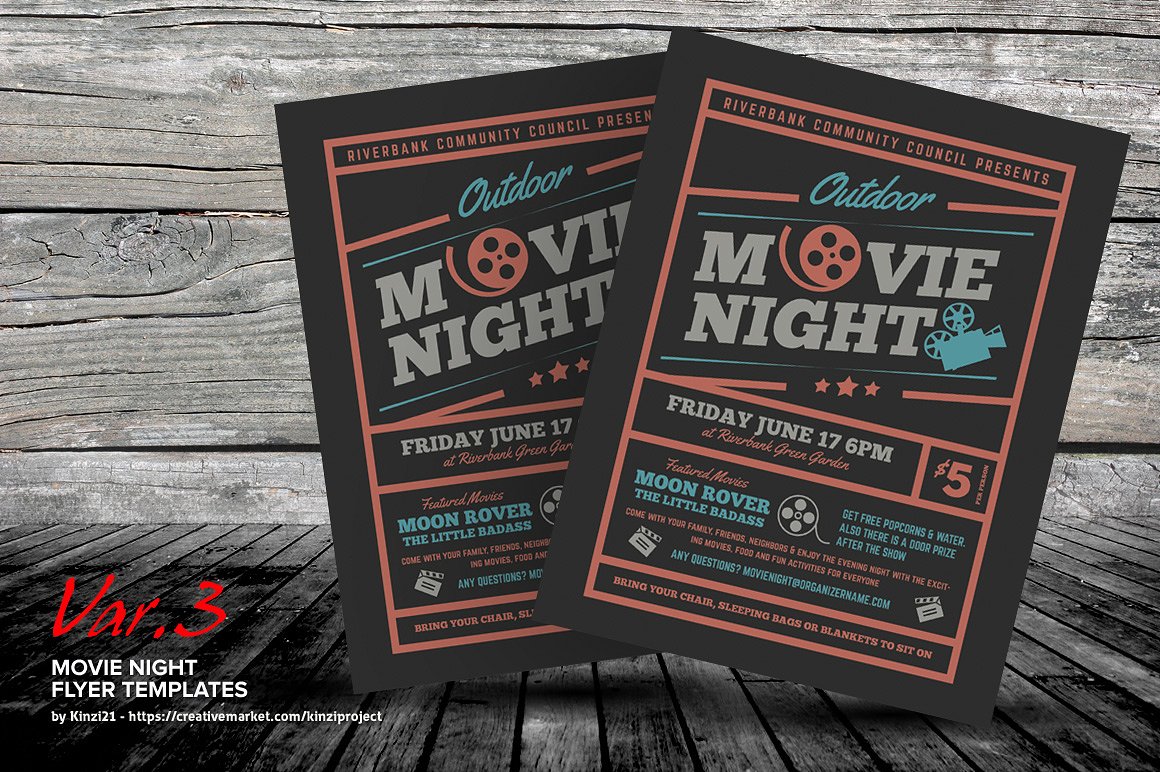
Movie Night Flyer
This mimics the ever important entry, the ticket which immediately translates to viewer’s regarding the event. It uses a subtle and subdued color palette and pairs it fonts with complimentary weights and styles. This set of movie night flyers comes along with three variations in designs and colors. The available print size is by the standard letter size of 8.5×11 in and is offered in a high-resolution format of 300dpi. One last more, it is print ready color mode of CMYK.
Super Offers Flyer
The striking feature of this flyer design is the placement of the call to action which is designated on top, giving the readers and viewers a focal point to start as well as emphasis on the promotion. The type of layout used in this flyer design is big type layout which directs viewers to the event name.
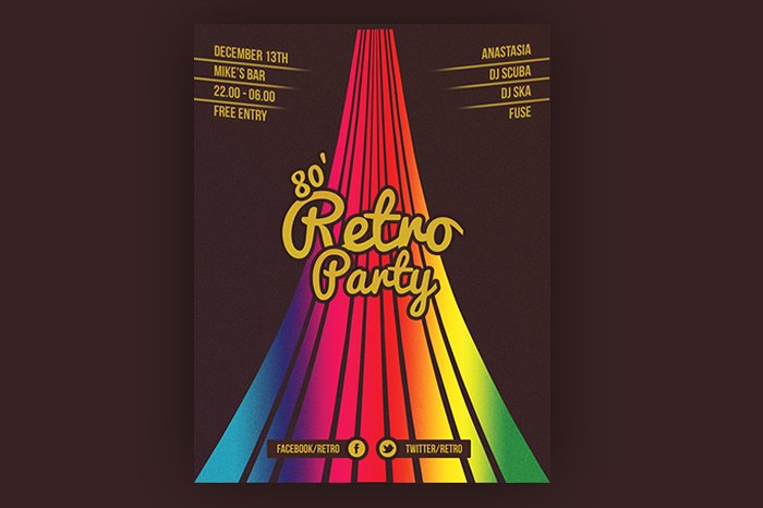
Retro Party Flyer
This flyer design uses an unconventional type of layout with most of the details are designated on top allowing users to read from the top down to the event name for introduction and down to the call to action elements. The colors help pave way in giving a groovy emotion. It comes along with a highres file and is easily customizable.
Tell Me More!
There are many ways on how you may design your brand’s flyer. While it all depends on your design preference and art direction, here are some of the details you might need to incorporate in your flyer design:
Images. Use images that are related and appropriate to your flyer. Keep it simple and away from any distractions or clutter. The bottom line, avoid using a busy background on your flyers.
Font. Unlike posters, flyers does not necessarily need extra bold fonts to be readable from far away. Pair the event or products name/logo with a readable and legible secondary font.
Layout. Flyers do incorporate a standard format in terms of layout. The upper part is designated for logo placement and the headline which is optional. The lower part is for the call to action elements such as social media accounts and contact information. The middle area could be for the event details and details and elements necessary to include.
The beauty of flyer design is the flexibility with its design and layout. Design your flyer according to your design preference and creative direction.
Before You Sign Out…
We have more offerings to share with you. Do you have a talent show to promote and advertise? How about we help you through our list of talent show flyers that will be helpful in spreading the news about any upcoming talents shows.
Related Posts
21+ Education Flyer Templates - PSD, Vector EPS, JPG Download ...
26+ Party Flyer Designs - PSD, Vector EPS, JPG Download
20+ Fast Food Flyer Design- PSD, Vector EPS Download
20+ Cosmetic Flyer Templates - PSD, Vector EPS, JPG Download ...
21+ Car Show Flyer Designs - PSD, Vector EPS, JPG Download ...
17+ Cooking Flyer Designs - PSD, Vector EPS Download
22+ Flyer Designs - JPG, PSD, AI Illustrator Download
21+ Massage Flyer Templates - PSD, AI Illustrator Download
21+ Free Flyer Designs - PSD, Vector EPS Download
19+ Tattoo Flyer Designs - PSD. JPG, AI Illustrator Download
20+ Bar Flyer Templates - PSD, Vector EPS, JPG Download ...
21+ School Flyer Templates - PSD, Vector EPS, JPG Download ...
21+ Insurance Flyer Designs - PSD, Vector EPS, JPG Download ...
20+ Band Flyer Designs - PSD, AI Illustrator Download
21+ Thanksgiving Flyer Designs - PSD, JPG, AI Illustrator Download
![Crafting A Brilliant Flyer Designs [ Essentials Needs, Process ] img](https://images.freecreatives.com/wp-content/uploads/2017/08/03bb0d49077533.5930e9d42b87e-e1502439749488.jpg)
