Do business cards still matter in the digital age?
Business cards are designated for immediate communication towards a client and let’s be honest, we tend to forget things. By having a visual reminder of who to contact in times of creative, business needs and so on is just a whip of a business card.
The thing is, with such a miniature size of a medium, the design, layout, message, and information kept at a minimum could make or break a design.
If you are on the next step in crafting your brand, be sure to check out below our examples of business card designs and gain insight on the design and technical process that goes with it. You may also go through our list of creative business card ideas to really set the mood for designing.
Don’t Leave these Behind!
It is important to keep the information and contact details in a business card brief since you only have a small size to work on.
Despite its limiting area, never leave these elements off of your business card:
Company or brand name. This is already a given when it comes to business card designs. Keep in mind to add emphasis on your brand name and not let other technical and design elements overpower such.
Job/professional descriptor. This part answers the questions such as your greatest fortes or with what you do professionally. Examples would include, “Sasha Velour, Visual Artist” or it could also be “David Hepenstall, Model + Makeup Artist” and “Jason Dardo, Cabaret Performer + Fashion Designer”.
Contact details. This is the critical part of the business card. It is a given to place your work contact information such as work address, website, contact details. Make sure to keep in brief, accurate, and updated.
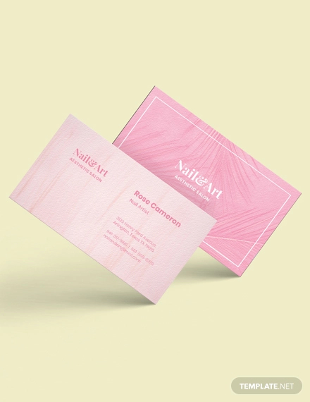
Nail Artist Business Card Template
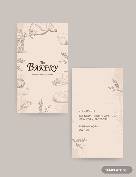
Bakery Shop Business Card Template
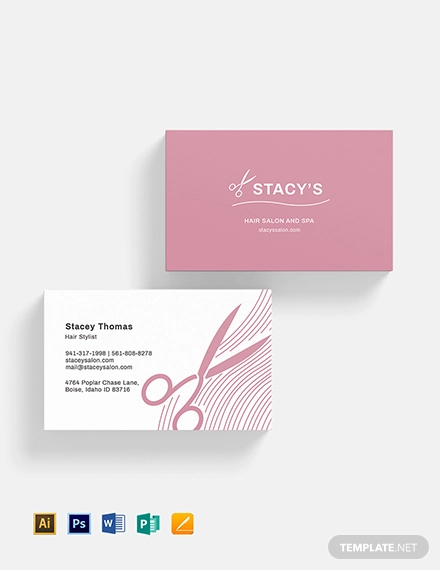
Hair Salon Business Card Template
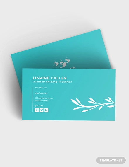
Licensed Massage Therapist Business Card Template
Taxi Service Business Card Template
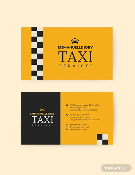
Elegant Bartender Business Card Template
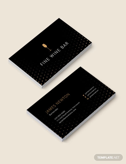
Bridal Makeup Artist Business Card Template
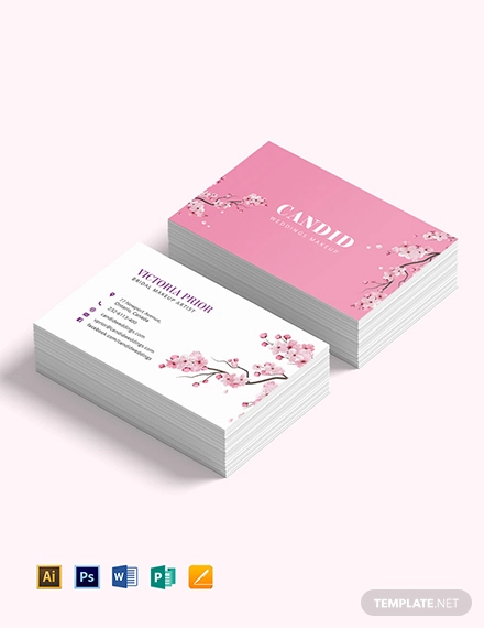
Creative Business Card Template for Designers
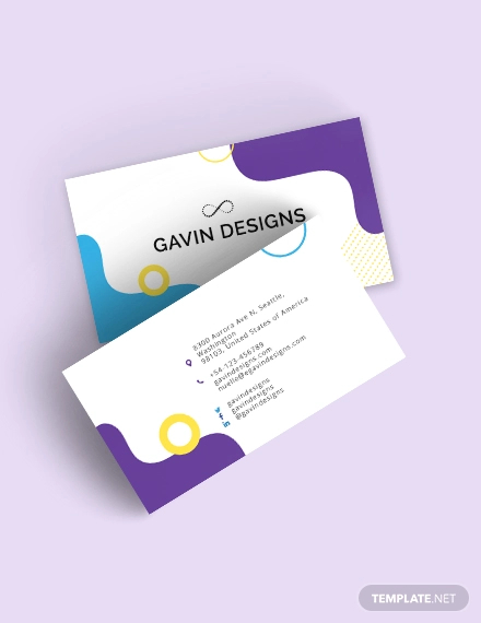
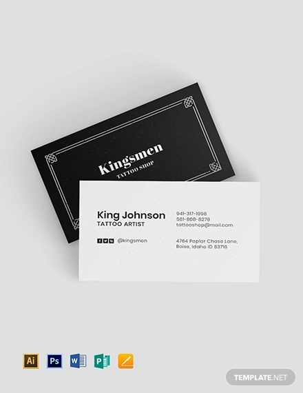
Creative Tattoo Artist Business Card Template
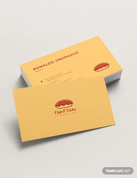
Cupcake Bakery Business Card Template
Katsy Garcia, Illustrator + Designer Business Card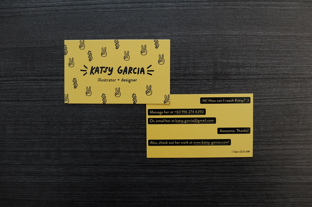

Business Card design and Personal Branding of Katsy Garcia.
The beauty of this business card is that it captures the responsive, quirky, and youthful personality of Katsy Garcia. At the back of the business card, it is designed to look like a chat box, more of having an actual conversation with the client asking for the designer’s contact details. Plus, you can’t look away with a bright pop of the yellow, which makes it a memorable design for a business card.
Designing Your Business Cards
You’ve got the idea and now we’re going to help you get by in turning your idea into a concept and with the execution. Even with a small medium, the design can make it or break a business card. It should translate your company or personal brand’s personality and the unique features it has to offer.
Make sure not to overlook the following technical elements as well, this is a practical process during printing:
Technical elements
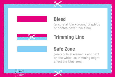
Bleeding. Keep in mind to add bleeds on your business card. Every starting designer must grasp on the design and printing process and why adding bleeds would turn your designing flow and printing a breeze.
Bleeds are added onto the end of a printing paper. This indicates an extra space which will be used as a reference in cutting and allowance on laying out an image. This may be a lay out beyond or exactly within the bleed, whichever is the design preference or art direction to be followed.
Bleed example on 1-2-print.co.uk
Size. There is a standard size for business cards which is 3.5 x 2 in. You may choose to follow the standard size but you may always go beyond it to match your creative brief and design preference. After all, branding is communicating the personality of a company or personal brand. Just don’t go over the standard size, giving the recipients a hard time reading all the elements in it.
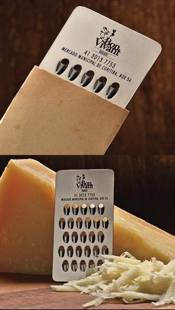
Material. We have been seeing unconventional business cards over the internet these days, just like the examples found directly below. If you are considering paper, do pay attention to the material that will be used for printing.
The standard business card material is 400 gsm, which is lightweight for a business card. Always check with the printing servic first on what paper material would be best for your design preference.
Bon Vivant Cheese Grater business card design on vivircreativamente.com
Designing Process.
Hierarchy. Incorporate an arrangement with the design elements, such as layout and text according to their importance.
- Layout. Incorporating an arrangement with the design elements on your business card gives a more cohesive and organized appearance to let your potential clients read the information found on the card itself.
- Text. Apply hierarchy on the text to add emphasis on the primary and secondary texts. This also adds a flow for the viewer’s on the text to read. Designers strongly encourage not to go below 6pt with the font size since this renders the text unreadable.
Font. For a cohesive brand identity, use the primary and secondary font or typeface you want to stick to. When selecting your brand’s font, it should be legible and allows readers to go through with ease since we’re dealing with a small sized medium with this design.
Color code. In this case, refer to your brand books in the use of color for your business card. Use the hex codes during your designing and printing process. If you are wondering what a brand guide is, you may go through our guide on crafting your very own brand book since these branding collaterals are equally important together.
If you haven’t found your brand’s color, don’t fret. We’ve got you covered with our list of color design tools that offer a spectrum of colors for an extensive color selection.
Business Card Design Ideas
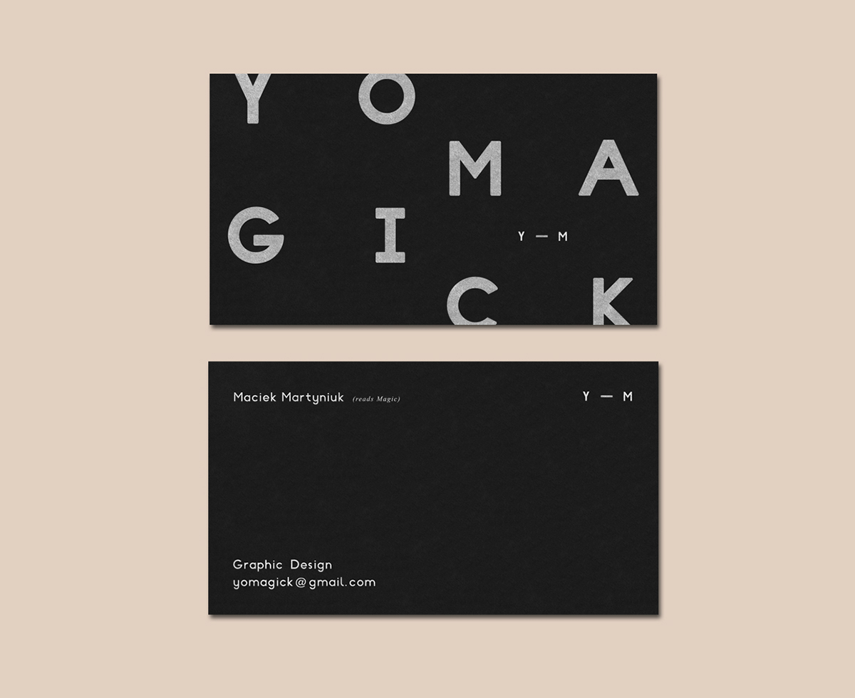
Yomagick Business Car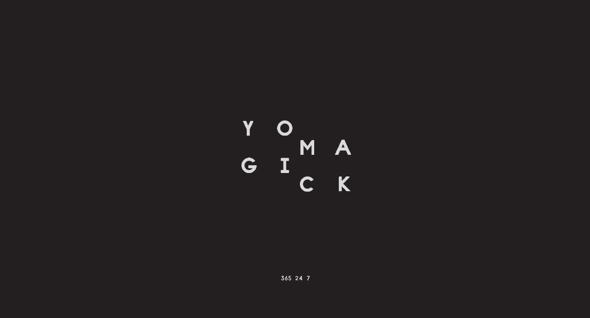

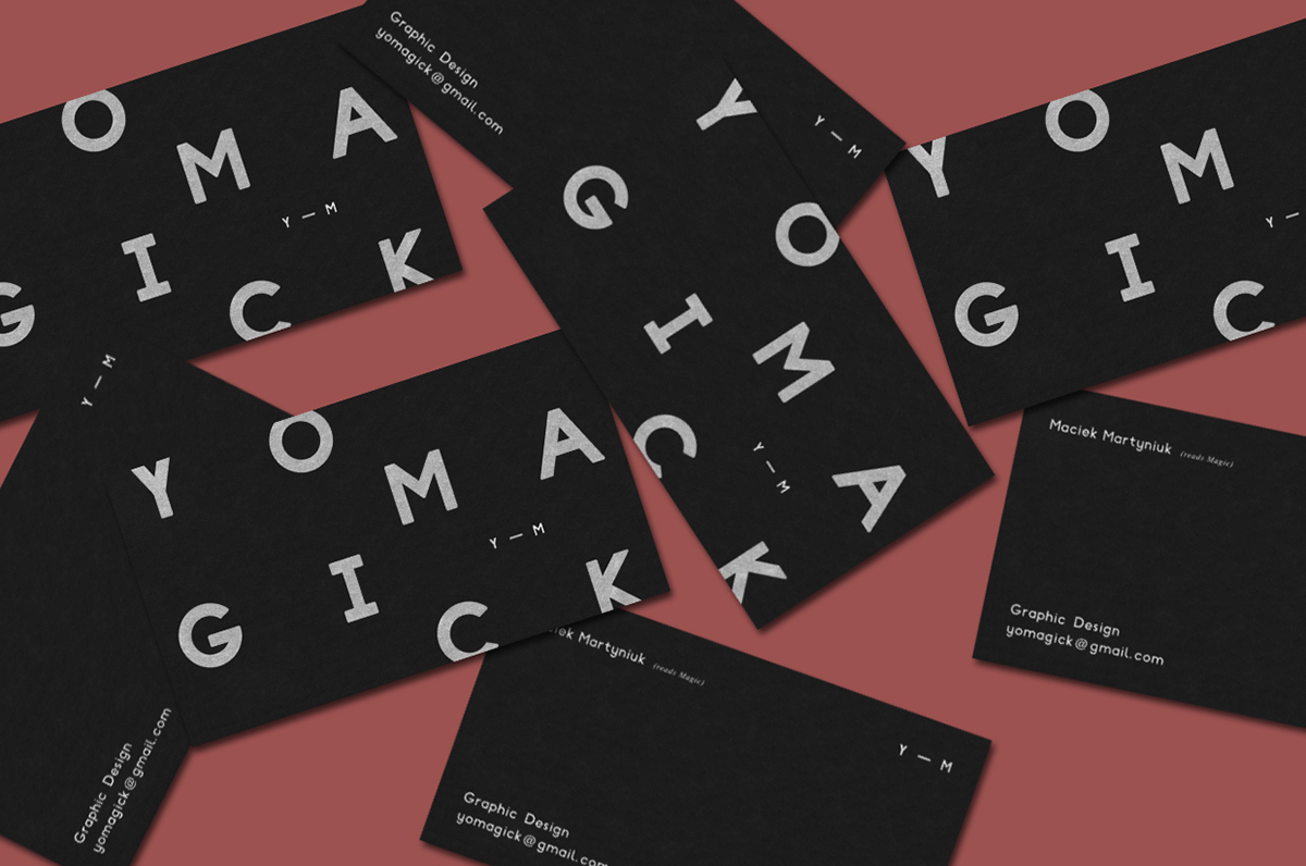


Yomagick’s business card design incorporates both positive and negative; minimal with an irregular composition of the front text which contrasts well with the simplicity at the back. The thickness of the primary font creates readability and the texture of the material gives the business card more character. With all the elements together, it results to a modern exterior.
Creative Mints Business Card

With the visible designing process of the Creative Mints business card, you will be able to see the shapes used in crafting the logo. The design applies symmetry and the use of geometric shapes which creates a mix of art nouveau and art deco design styles; both decorative and sleek appearance respectively.
If you are considering using shapes for your branding project or for a designing project, we have prepared a guide on the secrets of shapes that will give an insight on the interpretation and execution of shapes when used for design projects.
Harper & Blohm Cheese Shop Business Card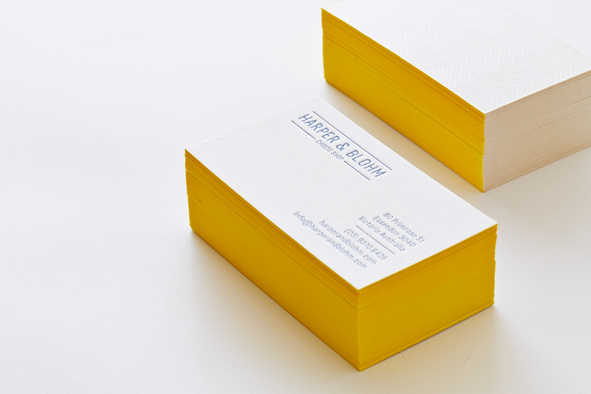
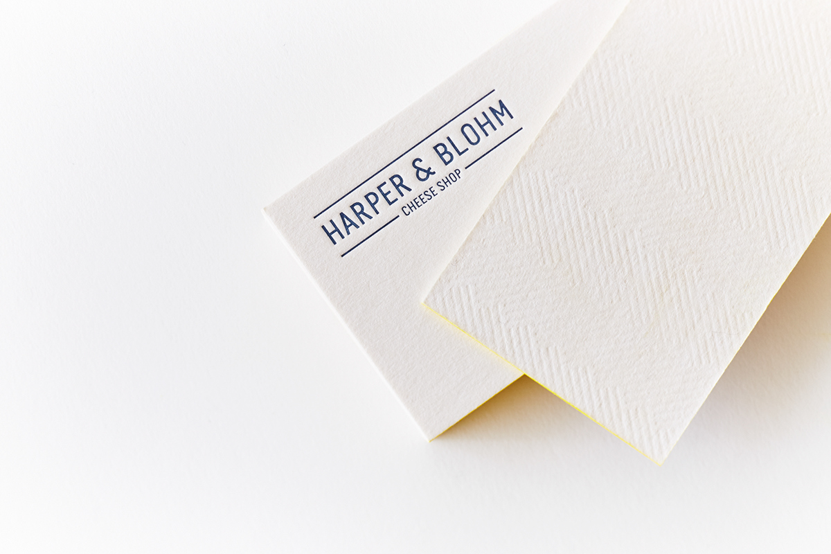
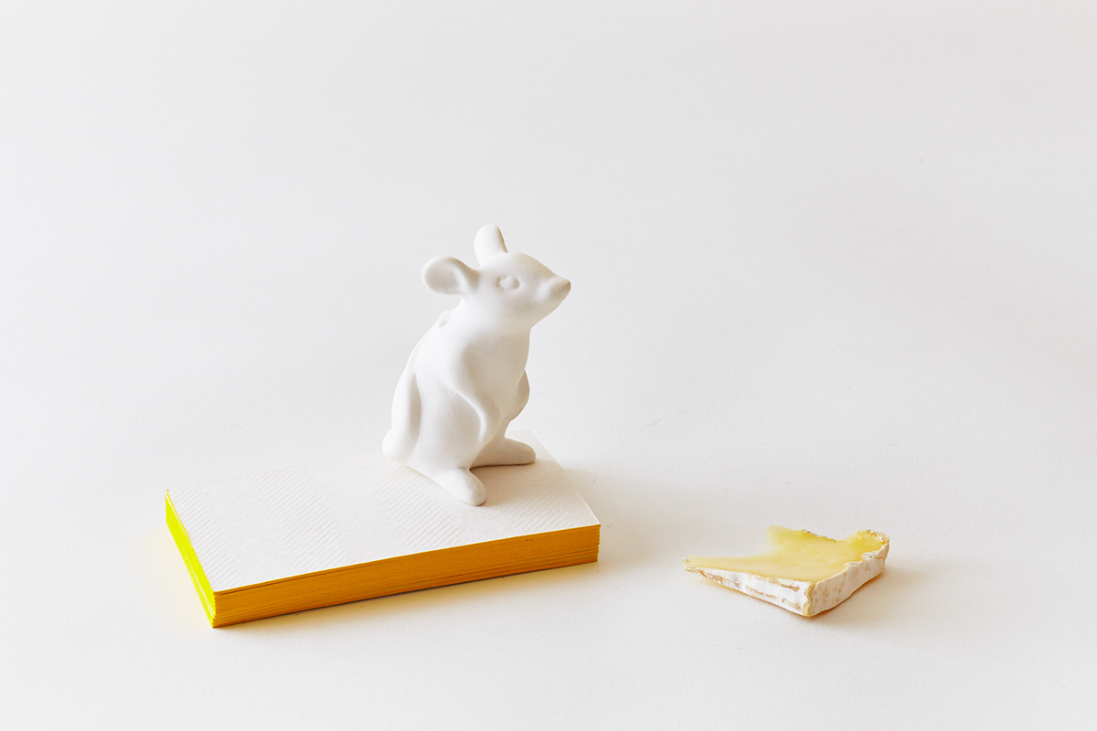


Harper & Blohm Cheese Shop on Behance
H&B Cheese Shop business card design uses a minimal layout which then gives the design a clean and direct approach. When stacked, you may see that the business cards resembles their product, Cheese.
They used a textured material for their business card as well as a complementary color scheme of yellow and blue. As for the design elements, they have applied hierarchy in terms of their brand logo and added a separation line in between the contact information.
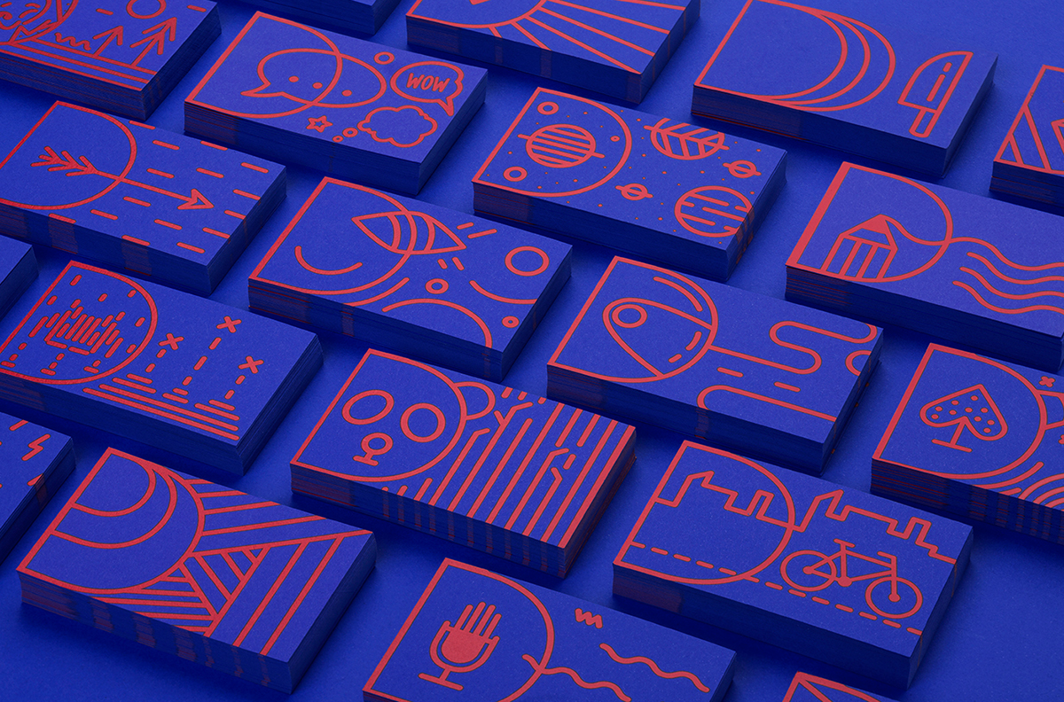
Drap Agency Business Card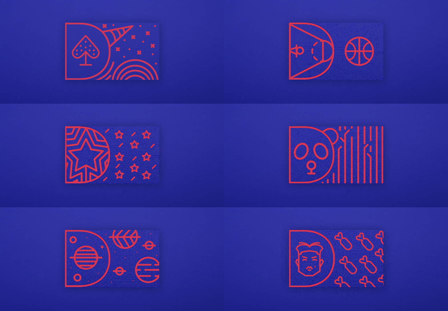
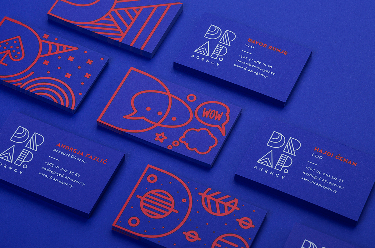


DRAP Agency’s re-branding translates playfulness and positive energy as their brand story across all their branding and branding collaterals. The idea behind their re-branding was to turn the core values of the agency into a shape-and-craft brand with personality and make it alive.
Their concept was to connect complementary and opposing personalities of Drap agency. Their business card also features with different designs from a unicorn, space director, and panda designs to closely match their staffer’s personal visual identity.
BKK Grill “Grill Me” Business Card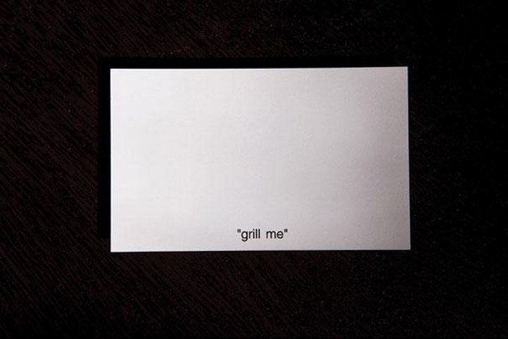
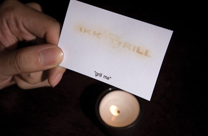
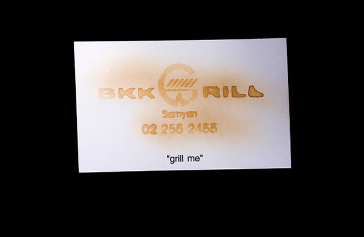


Talk about memorable with this “grill me” business card design. To execute a concept like this, the business card was stamped using lemon juice as ink. The design works on curiosity that immediately acquires the viewer’s attention with the only visible and initial text “grill me”. A simple use of gimmicks to turn out a fun surprise. Just try not to leave the card burning.
3D Tetrahedron Business Card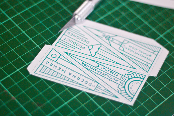

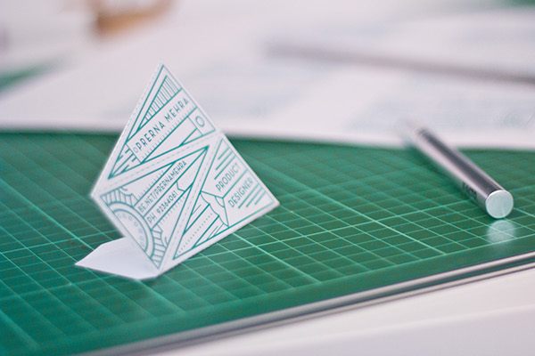
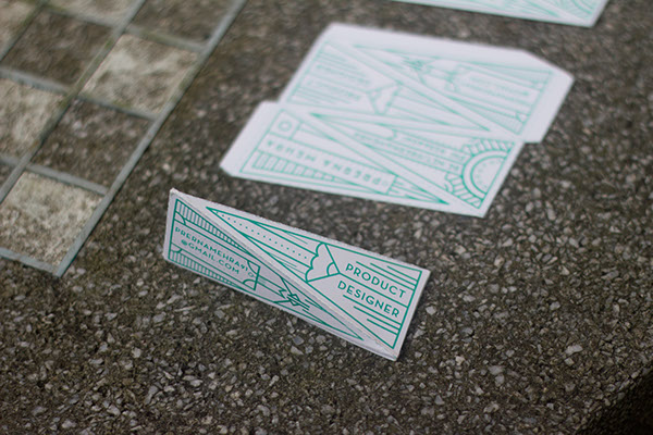


This business card design pertains to the designer’s professional descriptor of being a product designer. This design elevates business card designs froma commonly used flat material and amped it up into a pop-up and three-dimensional appearance.
With a beautiful and simple line art, it suggests an elaborate exterior. The use of a subdued and receding single color creates a cohesive exterior. It is to mention that the line art attracts the viewer’s to the design but it doesn’t overpower the core and contact details. The text is seamlessly put together along with the line art as well.
Laptop Business Card Design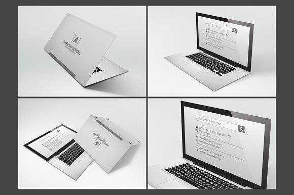
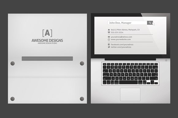


Going in a different creative direction does translate impact and memorability towards a potential client. Keep in mind that this design would take more consideration in terms of the designing process.
The design elements would be re-sized and might not be readable to some clients but let not those creative constraints hold you back. Experiment as much as you can and find what is best for your brand or company.
During Printing
Test print. This is a necessary process to take to ensure that all colors work cohesively as a layout and it is what you are going for. Most printing services are willing to do a test print first since this is a practical process.
There are some cases that two printing businesses have different results on its printed materials. To keep away from this situation, do choose a reasonable printing service that does print the true colors or at least close to the colors/color grading that you planned to achieve. Also, you may apply the exact same color palette, be it the primary or secondary, whichever matches the creative brief and design preference to ensure accuracy.
Layout.This is a different type of layout and not for design and aesthetics. This is the part where artists (who does the layout before it is printed; some printing services use this term) does the alignment and adjustments to a digital file before it is printed.
This is done as well to apply and fit your designs to the designated size and in this case, to your chosen business card size. Also, this is done to ensure precision during the cutting of your business cards.
Cutting. Most printing services have the availability for cutting business cards in a machine. It would be a breeze from then on when the layout for the business cards is well done.
Before We Call it a Day
If you want to see more creative business card ideas, we have listed those with our heap of business card designs to get your creative juices flowing. You may also check out our collection of portfolio designs that we’re sure to be inspiring and may be used as future references for design projects.
There is still one last thing we’d love to impart to you.
If you want a full proof protection for your business cards and if it’s printed on paper, you may apply lamination to your cards. Don’t fret, we’re talking about the softer lamination. Check with your printing service if it offers business card lamination.
This is to be done after printing and this is a practical choice as well since business cards printed on paper could acquire some wear and tears. Unfortunately, it could get thrown away. Sans a business card, how would we remember who to call in creative or business needs?
So get your creative juices flowing and start designing business cards for your profession, your company, or your brand altogether. Just make sure that you follow the tips we have enumerated above so you will not have a hard time. You can always visit our site once again in case you get stuck. Remember, we still have plenty of design ideas, tips, and tricks in the rest of our pages. You can even go and check them out now once you are done with this one!
Related Posts
9+ Plastic Business Cards
10+ Real Estate Business Cards
21+ Free Printable Business Cards
10+ Free PSD Letterhead Mockups
8+ Business Holiday Cards
Business Card: Common Mistakes You Should Avoid
20+ Name Card Designs
22+ Donation Card Design
20+ Personal Card Designs
Free PSD Elegant Business Card Mockups
18+ ID Card Designs
10+ ID Card Mockups
21+ Card Mockups
40+ Id Card Designs
23+ Free Printable Cards

