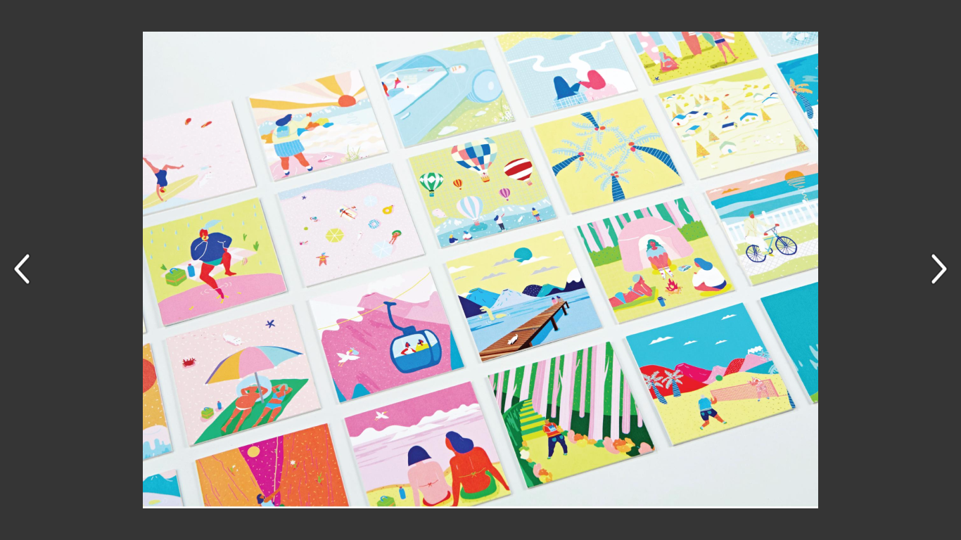
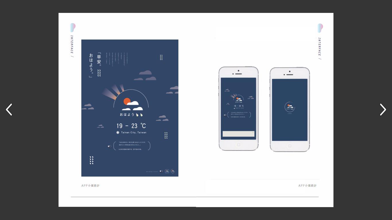
A portfolio is one of the last laps in developing your brand collaterals and it is a showcase of an individual’s creative ability and artistic intuitions. Now, it’s just as important to translate that in a way that best represents you as well as highlight your array of magnum opus. How you design your portfolio is up to your preferences and creative brief but the question is, which elements do you need?
Below, we have prepared a list of the things to include in your portfolio, be it for physical or digital. You can also gain creative inspiration from our heap of brilliant portfolio designs that will be helpful in developing your portfolio and as future references
Use the Right Medium: Printed, Digital, or Both!
Before incorporating the essentials in a portfolio, you also have options on where to place your works: print, web or even both mediums.
Print. While it is practical to print your portfolio for applications and job offers, it also offers a quick look at your work and CV. On the flip side, there should also be enough printed portfolios for you to use. In some cases wherein two or three companies ask for your portfolio, you still have more in store just in case.
Digital. You can go all out and be interactive with your portfolio when you place them on the web. This medium works well for multimedia designers and works since viewers get to interact with such. In case you need to show potential employers your web portfolio, you may provide a USB, CD, PDF file, etc., whichever works best.
Whether you choose to print or use for the web, you still need the essentials. Continue reading to know the things to include in developing your portfolio.
Designing a Portfolio: Things to Include
For Print
Table of contents. Whether it has few or multiple pages, do include a table of contents. This will give the readers a breeze in looking up your works.
Introduction. This will be considered as the rationale of your entire portfolio. You may explain your design styles and preferences, inspirations, brand story, and so on. However, remember to keep it brief and precise.
Curriculum vitae or CV. This is a practical addition to your portfolio. Tailor your CV to the type of work you’d like to be hired for. Potential employers or readers will have an outlook of your full working career as well as a visual imprint on your works in just one setting.
If you haven’t started in crafting your CV, you may go through our list of the things to include in a CV for a quick review or for future references.
Show your best works. Your works are the main highlight of this brand collateral. In terms of layout, make sure to make it visible enough to see the details of your works. If they are of a colorful exterior, keep in mind to have a test print to ensure the accuracy in color.
Share your process. Readers may want to know the idea and concept behind the works you set out in your portfolio. It does not need to be a lengthy explanation, just the entree of the meal being served.
Explain your role in each project or design. Whether a group or individual design projects, do explain your contributions. This is for an easy identification with your fortes.
Contact details. Even though a CV is already included, it is strongly encouraged to add your contact details on a separate page in your portfolio. This increases the frequency of your contact information that your reader will see.
For Web Use
While there is much creative freedom with having a web portfolio, the essentials needed to complete a such is similar to a printed portfolio. It still requires the six essentials previously mentioned, but there are also things you shouldn’t leave behind in your web portfolio.
These include the following:
Direct links. Whether it is a feature from a different website or your own created website, do include the direct links.
Contact details. While this is a similar category with the printed portfolio, for a web portfolio or resume you may add a message feature to ensure communication with your potential viewers.
Social media. Pertaining to contact information, you may also include your social media accounts be it Instagram, Twitter and so on. As well as your email, LinkedIn, Behance, and other professional or portfolio based accounts.
You can also go through our list of brilliant website portfolios that we’re sure you’ll love and be inspired of. You may also bookmark them as future references.
Don’t forget to..
Tailor your portfolio according to your audience. Let’s be honest, you can’t reach a large mass of audience. Not all individuals have the same preference and taste, unless you are going to reach the masses. But in some cases, your product, service or brand is tailored to a specific target audience, and so does your portfolio. This is intended to obtain a measured response from your target audience and prospects.
Speak in the right tone. This is true whether you are speaking your brand’s tone or what you think is the appropriate tone for your portfolio.
Pick a versatile platform. Yes, this goes to how your portfolio will be presented, be it printed or digital.
Portfolio Examples to Live By
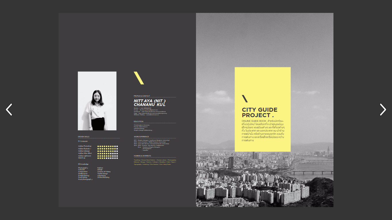
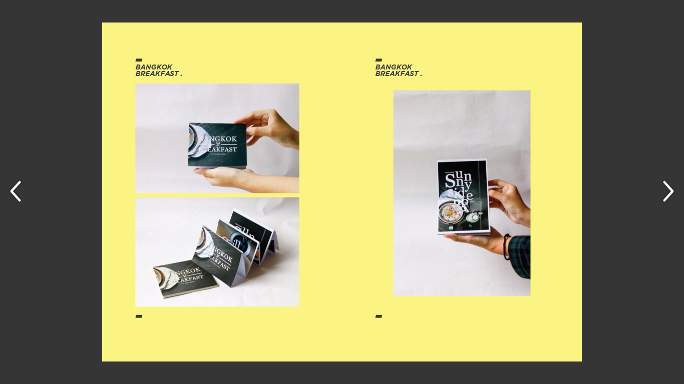
Nittaya Chananukul Portfolio


This portfolio uses a simple and modern layout with its well-contrasted color palette of yellow, gray, and white. The minimalist layout creates an emphasis on the works and the use of colors does not overpower the design elements but it results in a cohesive overall design.
Soleil Ignacio Website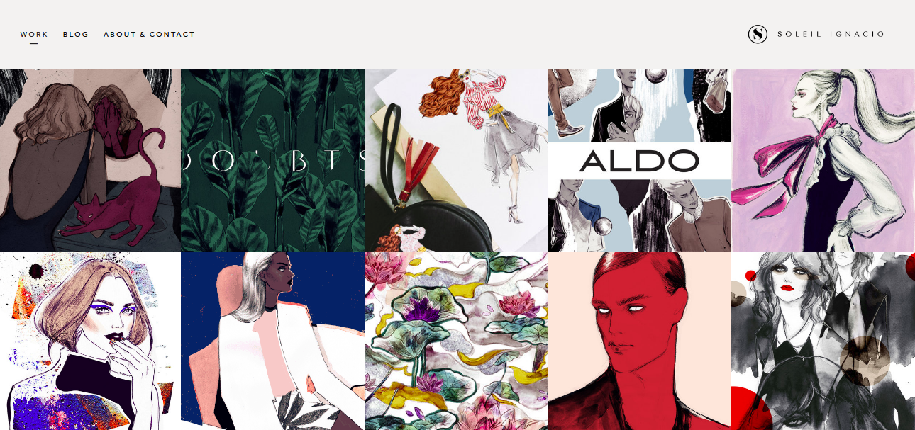

Soleil Ignacio’s website incorporates a direct and simple UI where you could immediately browse through her portfolio with ease. You could see her recent commercial and personal works at first sight.
Aunchayanan Nakprasop Portfolio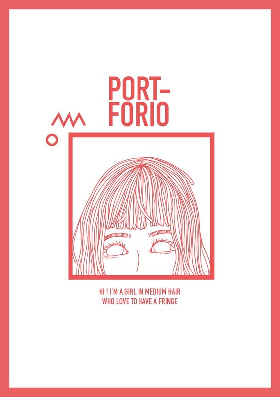

Aunchayanan Portfolio on Issuu
Aunchayanan’s Portfolio exudes this endearing exterior with dominant use of illustration in terms of the portfolio design. It grabs inspiration from the zeitgeist in the 80’s but with added modern design style.
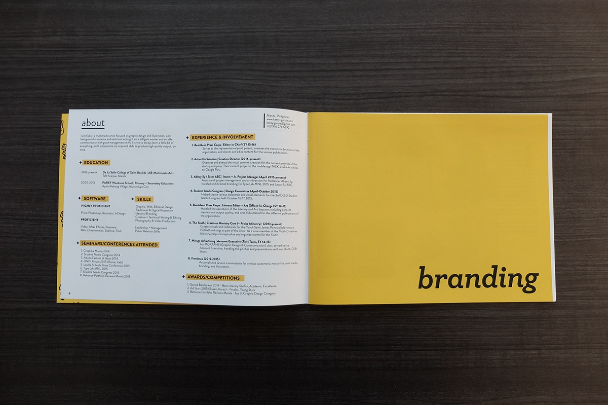
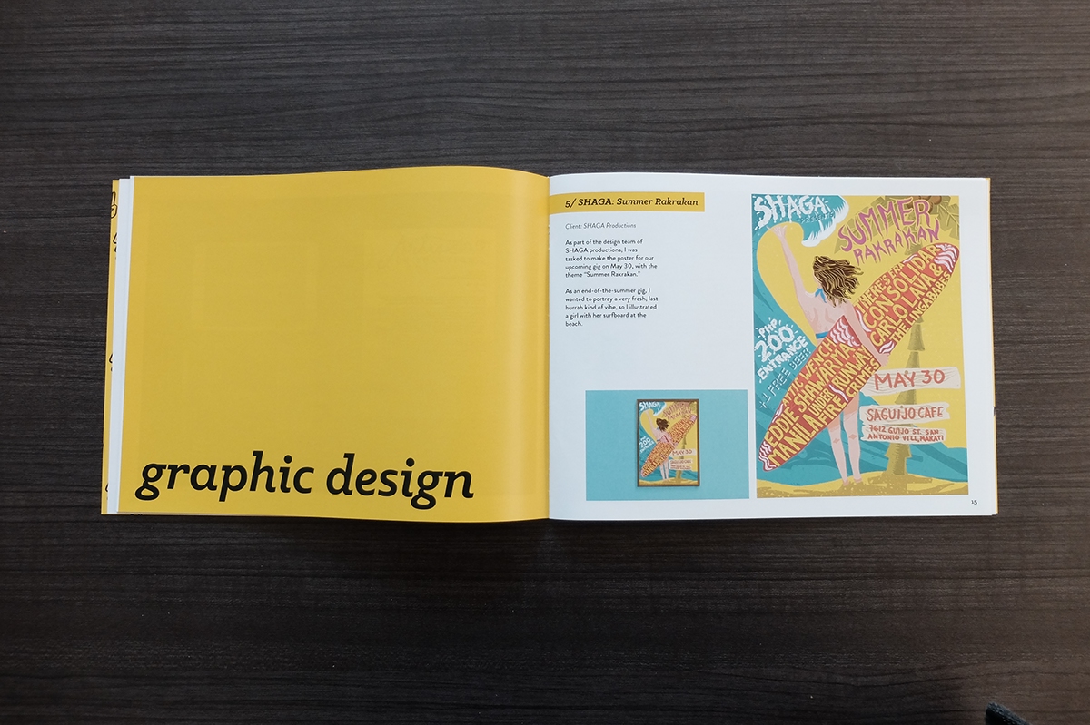
Katsy Garcia Portfolio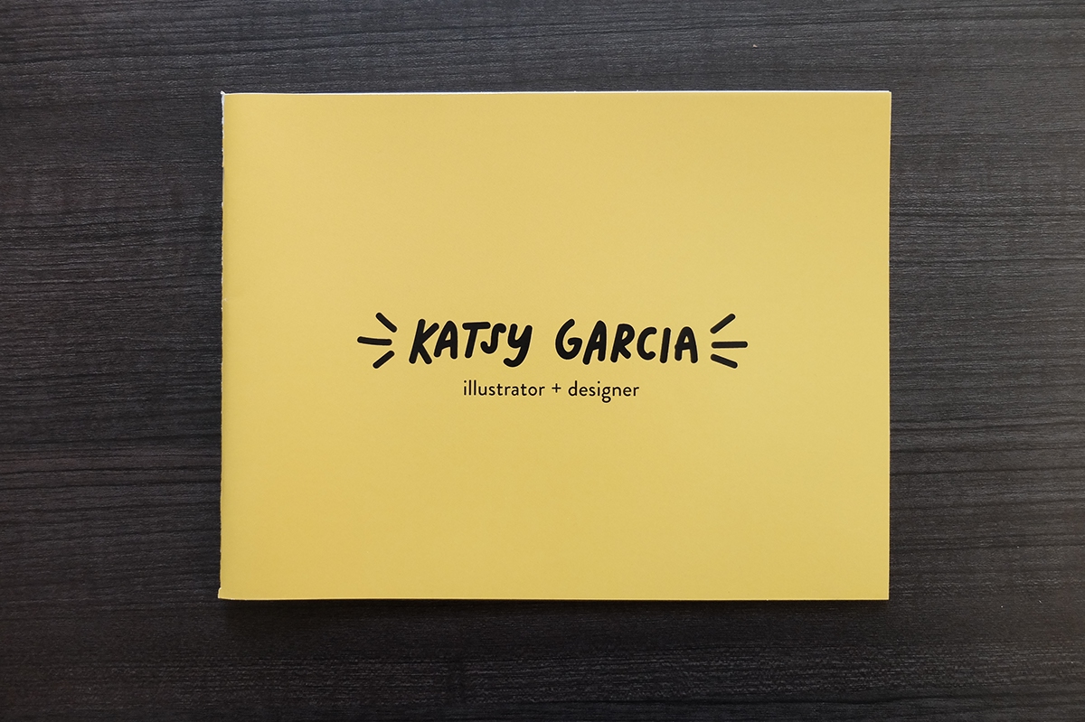

Katsy Garcia’s portfolio is of simple design and layout with practicality in mind for mass production. The portfolio design has been toned down, removing most of the iconography and graphical elements found across all her branding collaterals; thus, giving an emphasis on her works.
Kateryna Senko Architecture Portfolio
At first sight, the use of different materials is evident in her portfolio as well as with her architectural designs. This layout exudes ruggedness and practicality in both portfolio and designs. The works provided are mostly images which work best for an architecture heavy portfolio.
Shino Lu Portfolio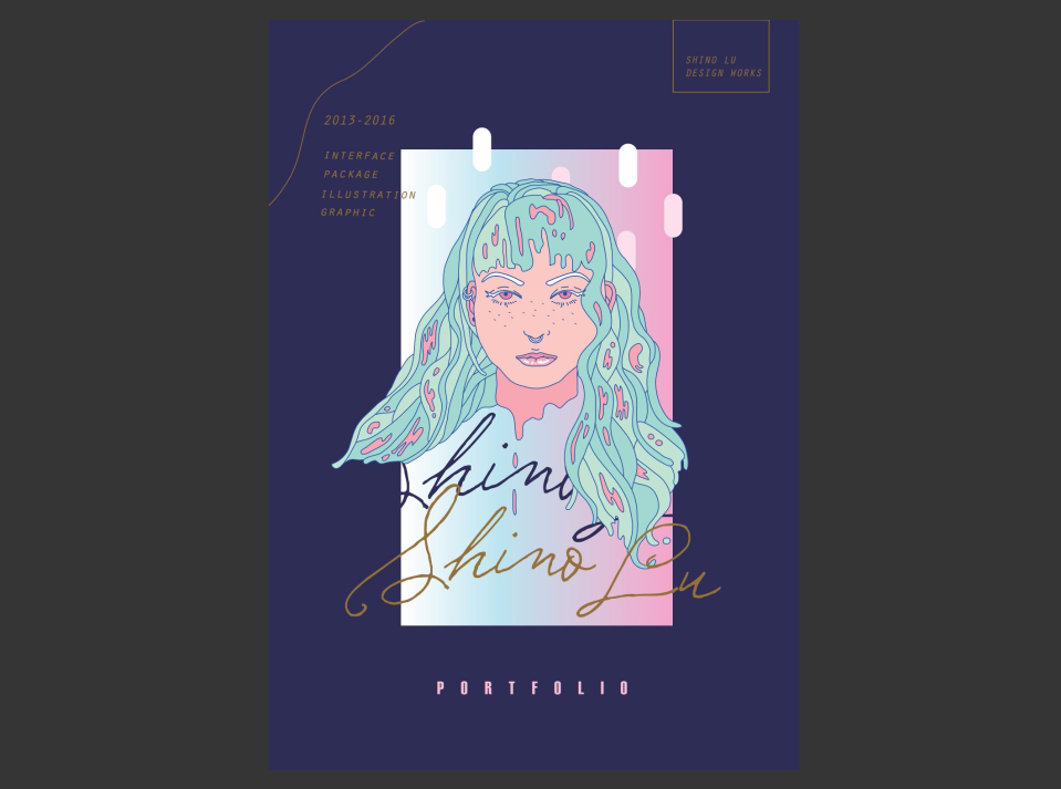

The cover page translates an ordered type of layout evident across all pages. It features a minimalist composition with its line up of works and the repetition of brand identity.
Let’s call it a day with one last suggestion from us. On a yearly basis, there is a color that best represents that duration that takes it inspirations from natural elements as well as social issues. Pantone, as a recognized color matching innovator, hosts an annual Pantone Color of the Year in which introduces a color that will best represent the current year. You can go and check out the Pantone Color of the Year 2017.
Related Posts
9+ Fashion Photography - JPG, AI Illustrator Download
240+ Free Hand Drawn Vector PSD Doodle Icons
9+ Dancer Silhouettes - JPG, Vector EPS, AI Illustrator Download
21+ iMac PSD Mockups - Free PSD, Indesign, AI Format Download ...
Free psd Resume Template Design
10+ Peacock Logo Designs for Inspiration
23+ CD Packaging Designs - PSD, Vector EPS, JPG Download ...
40+ Mobile UI App Design - PSD, Vector EPS, JPG Download ...
20+ Financial Brochures - PSD, Vector EPS, JPG Download ...
Inspiration
52+ Photography Logos - JPG, PSD, AI Illustrator Download
20+ Free PSD Postcard Mockups
Download 30 Free Psd Web Browser Mockup Designs
21+ Photography Flyer Templates - PSD, Vector EPS, JPG ...
21+ Wedding Invitation Mockups - PSD, Vector EPS, JPG Download ...
