Design elements are the vital organs for bringing any magazine, brochure, flyer, newspaper or newsletter to life. The main elements that come to play while designing a magazine include the headers, image captions, pull quotes, subheads, bylines, kicker formats etc. These elements need to be pre-designed before putting the magazine contents together.
The other basic elements of flawless designing
The other basic elements of design include line, shape, balance, gradation, harmony, dominance and contrast. All of these pertain to graphic art and designing; the templates for these elements can be downloaded as vector PSD files with editable layers which makes a designer’s work a little easier.
1.Typography
Typography is a major design element of any graphic web design or template, and may as well be the most important. It catches the eye of the viewer and can be a make or break you’re your design. Typography also gives readers an overview of the kind of content they are about to read. Perhaps the single most important part of graphic and web design is typography. Before you choose your typography, it’s important to understand the kind of contrast, size, leading and kerning that you want from your design. Words are definitely important, but the style in which you portray them is just as important.
2.Color
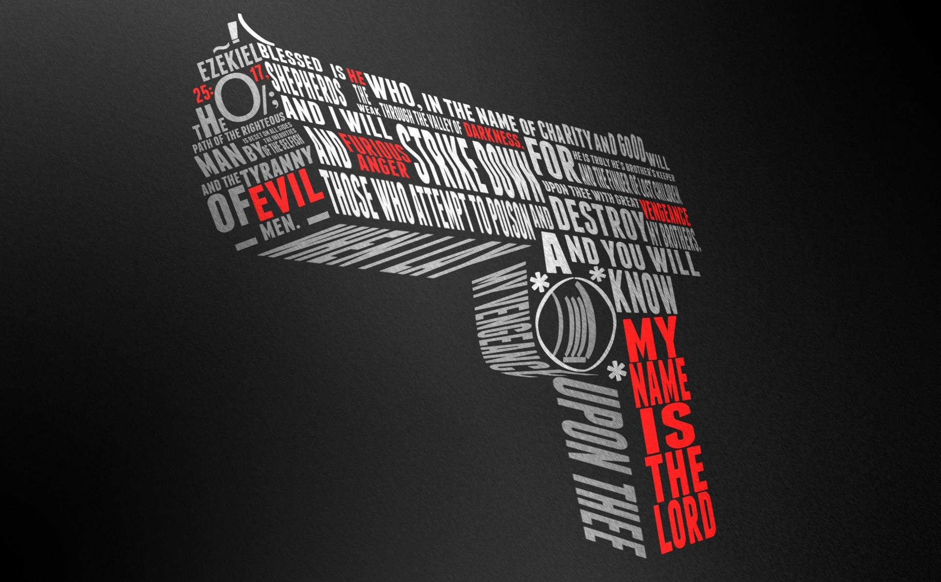
Color is another essential design element and has the most subconscious impact of your readers because it is the most obvious of your design elements. It even impacts the designer, and can be used on its own or along with embossing or engravings. Color can also be added as a background, to be used with a combination of other elements like lines, textures and typography. The color of your design will ultimately set the overall mood of your article, website or template. You can employ the use of color theories to create a logical structure for your design.
3.Space
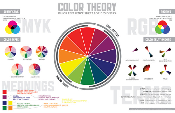
Space is one of the most underrated design elements because something like negative space is often the most underutilized, unappreciated and heavily misunderstood aspect of designing a page. The empty space in your design, whether intentional or by coincidence, adds to the overall image and look of your page or template. The best part about unused to negative space is that you can use it to create shapes as you would with any other external elements. Once you’ve mastered the design considerations of flat space and learnt the basics of having a linear perspective, you can use space to your advantage.
4.Size(Scale)
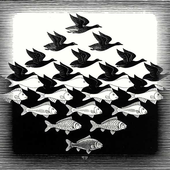
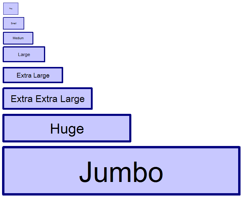
The size of your fonts, images and designs will have a huge impact on your readers. So, it is essential to toy with the settings that deal with the scale and size of all your shapes, objects and other design elements. Manipulating the size of your elements not only makes your page unique, but will add value to its appeal. The amount of variation that you bring into your design will have an effect on the overall design of your page, and that variation will be totally dependent on your content. In page design, the discussion of the scale is usually in reference to the size and quality of the elements, along with their relationship with each other.
5.Shape
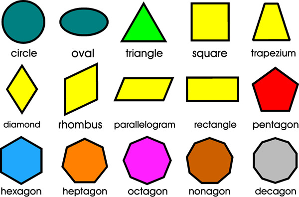
Shapes have a natural tendency to attract readers to them, before they go on to read your content. They have the characteristic of adding interest to your page, whether it’s an organic or symmetric shape. The most basic concept of a shape is that it is defined by clearly marked boundaries, which can include lines, border, or even specific colors. Their main purpose is to emphasize a particular portion or aspect of your page. Ultimately, everything that you add and modify on your page is a shape, and you need to consider how all these elements will affect the overall design of your page.
6.Texture
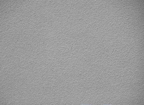
Although most page designers would argue their purpose, especially when you can’t physically touch it, texture can add depth when there is none. And today’s modern websites and graphic designs rely quite heavily on the look and virtual feel that texture provides to a web page. A texture can create a captivating 3d image of an otherwise boring 2d impression, making it look richer and deeper than it actually is! And if viewed on the right kind of screen, can be the element that seals the deal for your design approval. Texture makes elements appear more real, resulting in an emotional response from the viewer.
7.UI
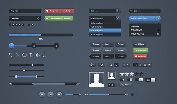
The user interface or UI is a design element that has been designed to control all the other elements. A UI is focused on predicting what a designer needs, when they need it, and whether they should keep it ready for use. This ensures that the page designer is equipped with and interactive interface that provides them with easy access to all the elements that they want to modify. A user interface is the binding force that takes a design concept and presents in as an interactive design. It is important to remember that the best user interface is one that is powerful, yet invisible enough that it doesn’t hamper productivity.
Related Posts
FREE 16 Credit Card Designs in PSD | AI
FREE 32 Ultimate Photoshop 3D Text Effects
FREE 23 A4 Brochure Designs in PSD | InDesign | MS Word | AI | Publisher
FREE 39 Photoshop Custom Shapes in Vector EPS
FREE 17 Photography Flyer Templates in PSD | Vector EPS
FREE 16+ Stamp Designs in PSD | AI
FREE 23 Portfolio Template Designs in PSD
FREE 19 Metallic Effects in PSD | AI
FREE 31 Best Magazine Design Templates in PDF
Color Theory To Your Brand Identity
FREE 24+ Logo Design Examples for Brand Identity
FREE 14+ Advertising Ad Banner in PSD | AI
FREE 23+ High-Resolution Blurred Background Designs in PSD | AI
FREE 8+ Cool Tattoos in PSD | AI
FREE 17+ App Login Pages in PSD | AI
