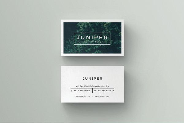
Business cards offer a practical use of communication toward potential clients and prospects. The beauty of business cards is the best representation it demonstrates toward an individual and owners, as well as the different design styles and ideas that are incorporated into a compact medium.
In our extensive collection of business card designs down below, we made sure to feature a variety of design ideas to inspire your creative eye. The list ranges from the clever use of situational transactions, unconventional materials, and simplicity.
To help you get the best of crafting business cards, we have prepared a list of unique design ideas that will be of great use for design and brand identity projects. The list also includes the technical process that comes along with it.
A Lineup of Business Card Designs
Business Card Design Template
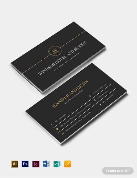
Consulting Engineer Business Card Template
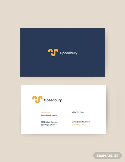
Cleaning Service Business Card Template
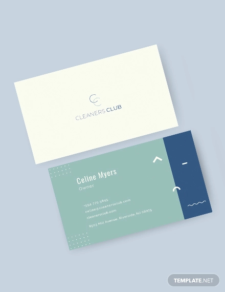
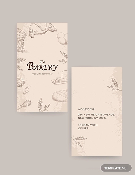
Bakery Shop Business Card Template
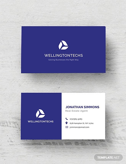
Corporate Business Card Template
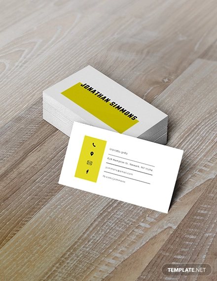
Simple Business Card Template
Sarta Milano Branding, UI/UX and Packaging
The Sarta Milano branding embodies simplicity and modernity. The bold use of narrow and regular weighted type brings about personality and stability to the exterior. The use of irregularity with its sub-name demonstrates playfulness in a rather minimal design.
Claire Bruining Personal Branding and Branding Collaterals
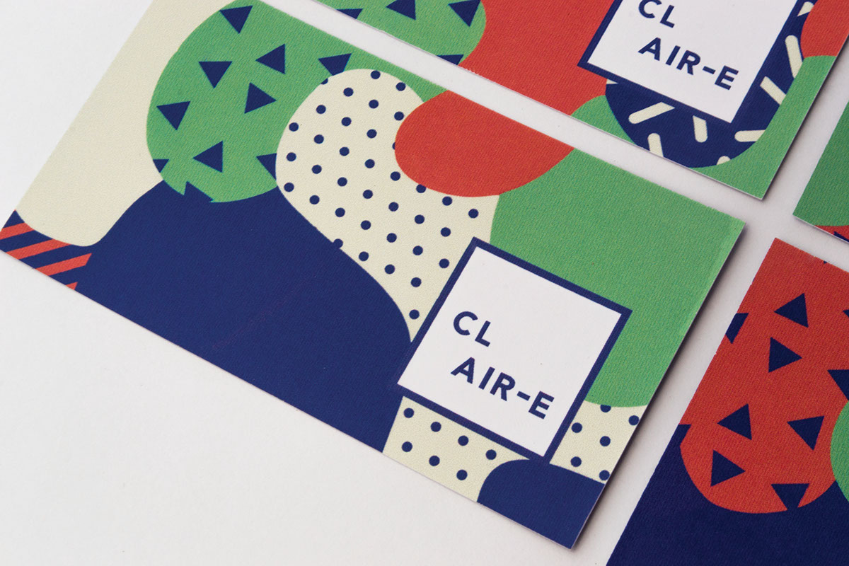
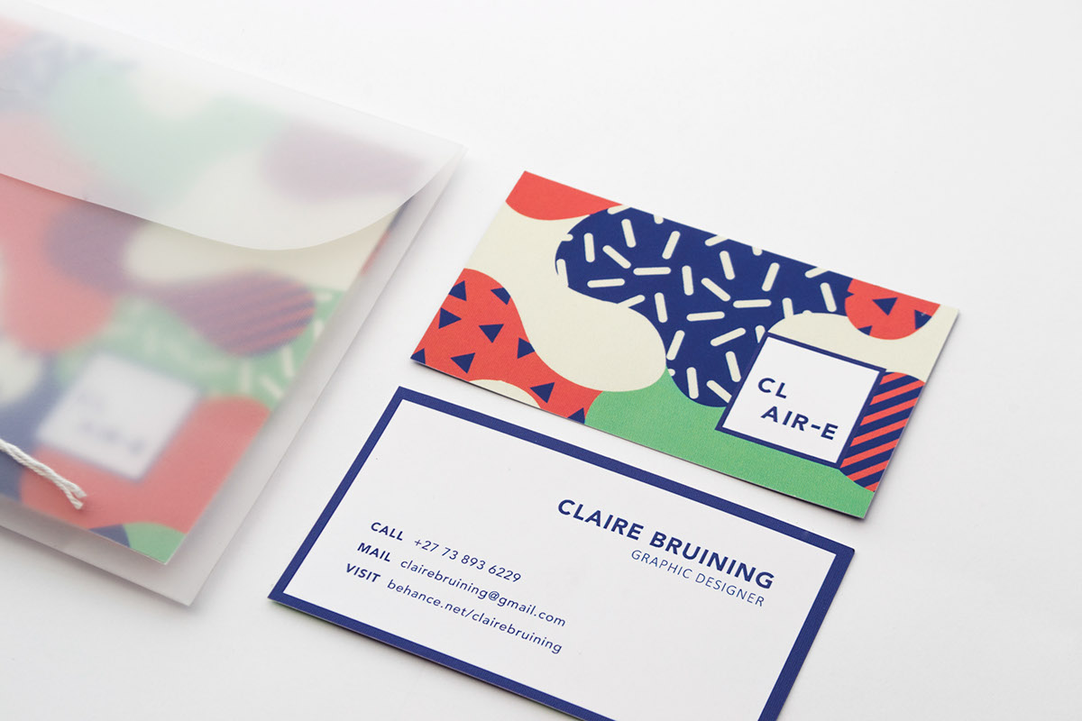
Set in an 80s exterior, this branding collateral from Claire Bruining revisits a retro design style. Organic shapes bring about fluidity and sans of any limitations while the geometric shapes even out the playfulness and mixes in boldness, which gives a great result with its exterior.
It displays a different appearance with its front and back parts bring about a balance with the two varying designs. This also gives viewers a clear scan through the information being presented.
Ayako Okada Pop-Up Business Cards
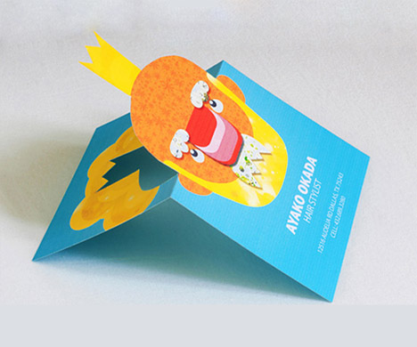
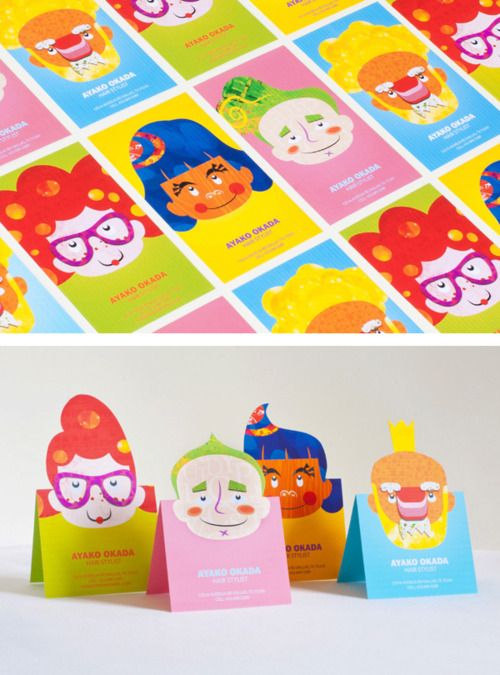
Subjectively, the top of mind for this business card was a quick haircut process without having to sacrifice great results. Ayako Okada, a hairstylist, crafted a fully realized idea with its business card. The message of the brand is conveyed appropriately and directly once in contact of the viewer and user.
It uses a variety of colors and characters that give the impression that the service are offered to all individuals and loyal clients.
Colorful set of Branding Collaterals of Vrrb

The use of pops of color wasn’t intentional but it made it work for the overall visual identity. This example incorporating a spectrum of colors onto a compact medium can be great move since it offers a wide range of character for the brand. Just keep in mind to be consistent with the overall branding.
To help you get by, we have listed an extensive aid on creating your brand guide. In situations wherein you want your brand to be consistent such as using design elements and regarding the use of color as previously mentioned, a brand guide will serve as a direction and is filled with instructions as to the proper logo usage as well as the typographical, color and imagery usage and placements.
B U Z Z W O R T H Y Branding
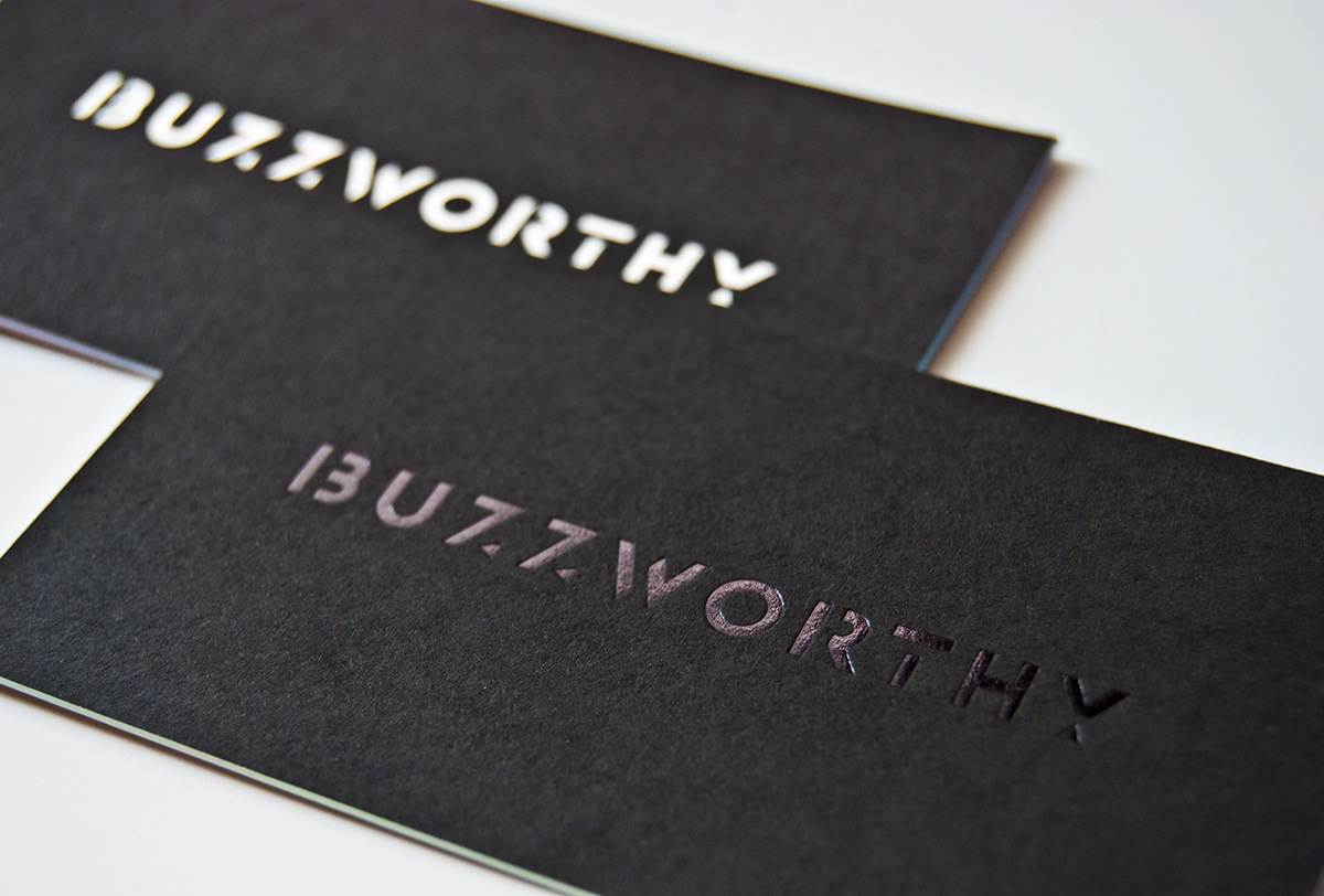
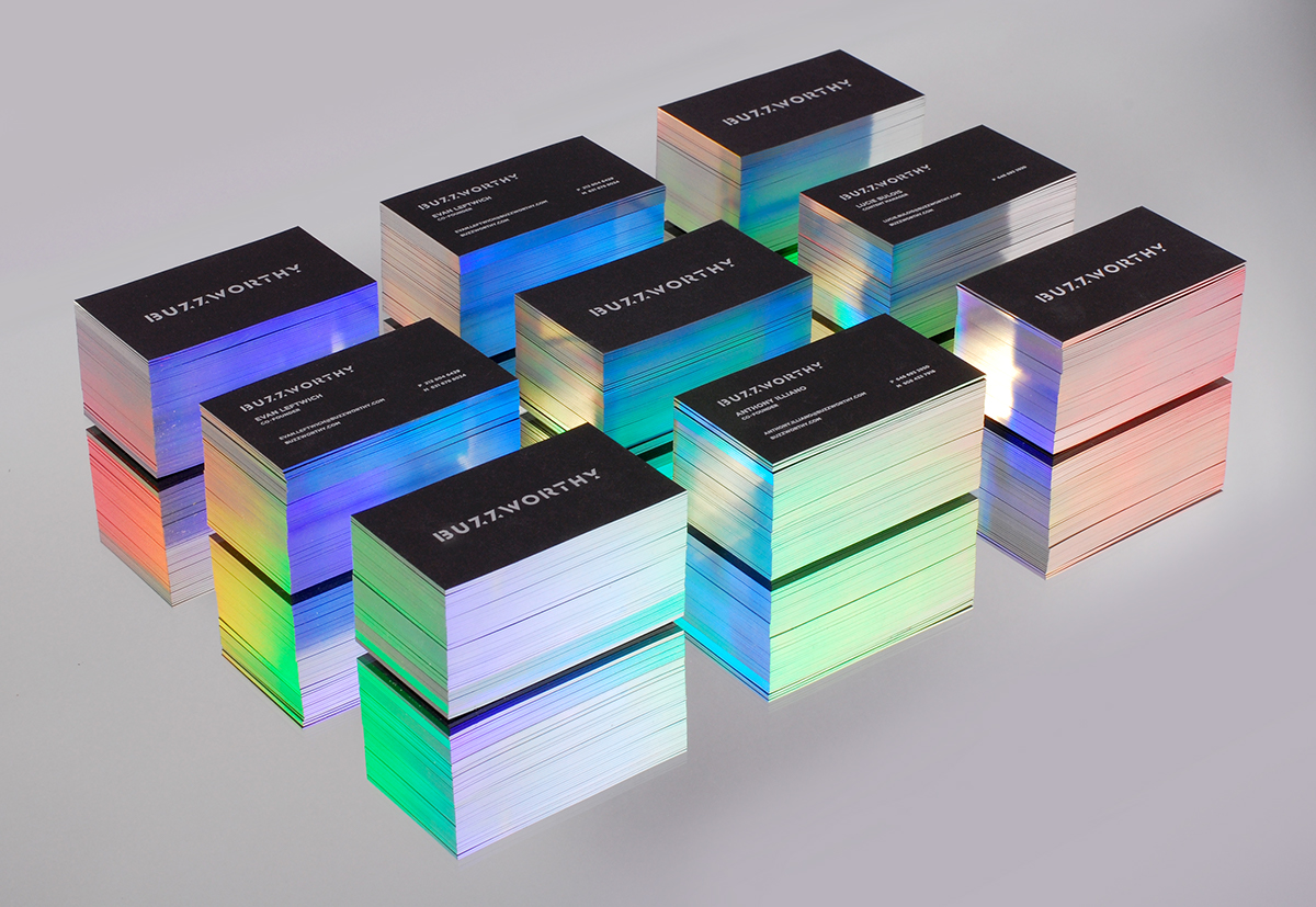
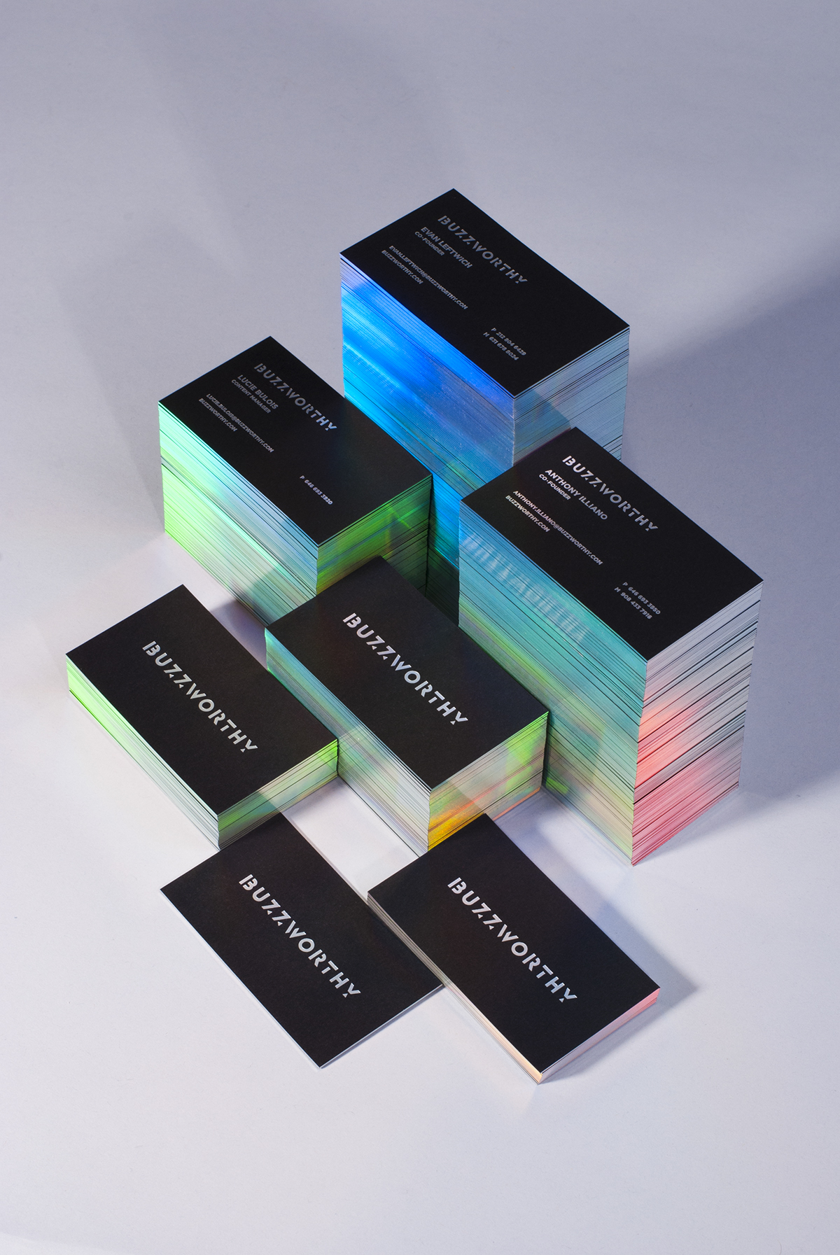
If you are considering a touch of illumination or a fresh spin on business card design, then the Buzzworthy Branding demonstrates the use of defraction and edge-painted treatment on their set of business cards. Buzzworthy, indeed. With its bright stacks, the business card is balanced with the use of black as the primary color to bring sleekness to the appearance.
Sonja Kreuzberg Branding & Art Direction
The use of holographic technique presents the compact medium in a way that is appears as three-dimensional. It is a statement piece as well as bringing about a nostalgic emotion.
AnotherArt.com – Branding, Packaging & Graphic Design
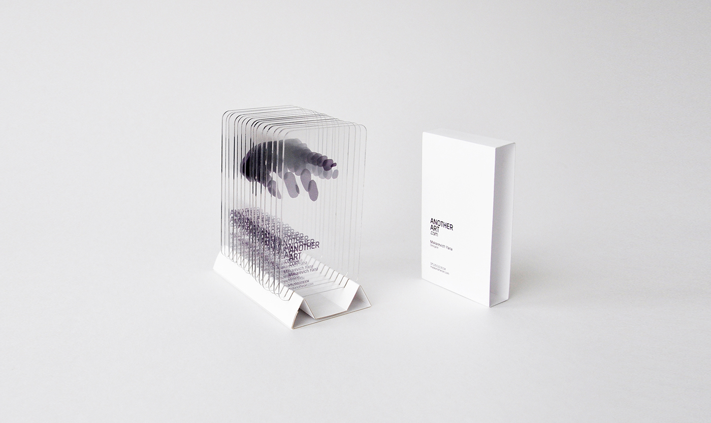
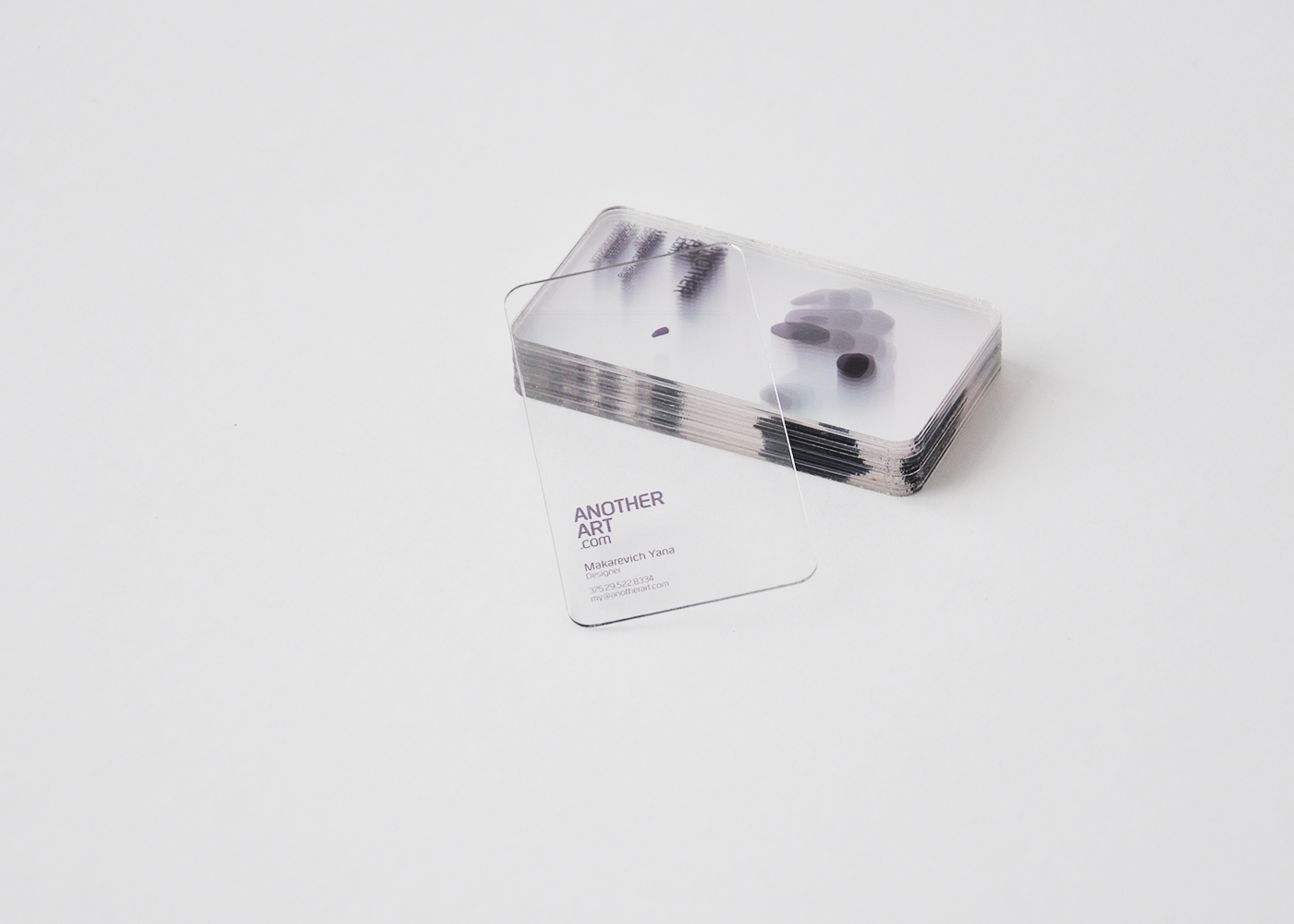
Before anything else, you must visit the Behance page where this impressive business card is housed directly below to be immersed of the beauty, concept, and creative direction brought about by this business card. The use of unconventional material can also give the business card longevity unlike the use of paper can wither the medium shortly.
Marcin Usarek Personal Business Card
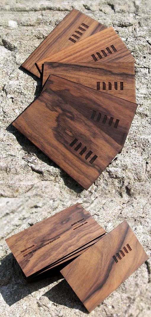
The use of unconventional material is presented twice in a row, and this time, wood is taking center stage—plywood, to be specific. Similar to the previously mentioned business card example, it takes much more wear and tear before being deemed unusable.
Even though a minimal application of design and technical elements are to be placed on the wooden material, the simplicity offers a great deal in brand representation and probably in terms of production.
Luxurious and Foiled Garance & Fils Business Card
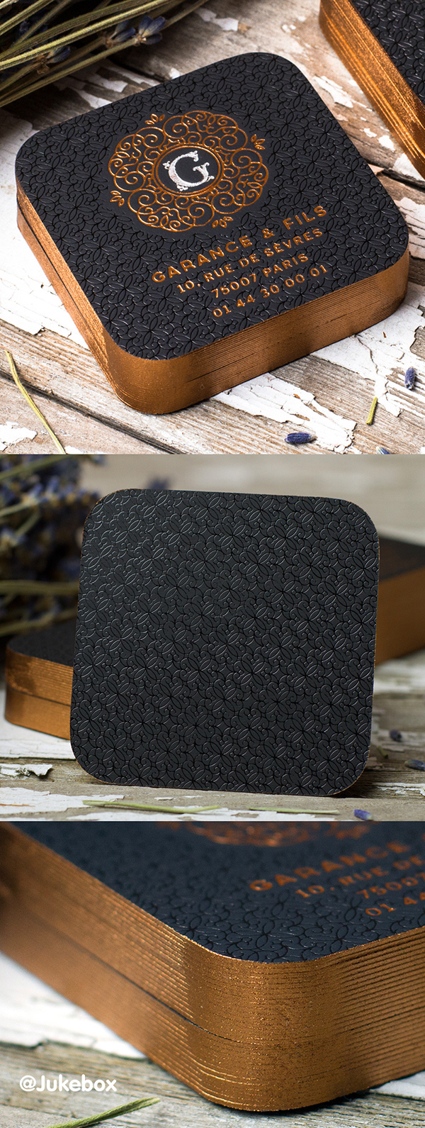
If you are to set forth on a luxurious design and appearance for your business card, then this foiled medium from Garance & Fils is a great reference and design inspiration. The texture is made possible with the smooth suede stock paper material as well as the emblem logo and card information are created with three foil colors: Metallic Copper, Metallic Black, and Matte White. The edges are completed with copper-colored edging.
Kevin Hamon Embossed Letterpress Business Cards
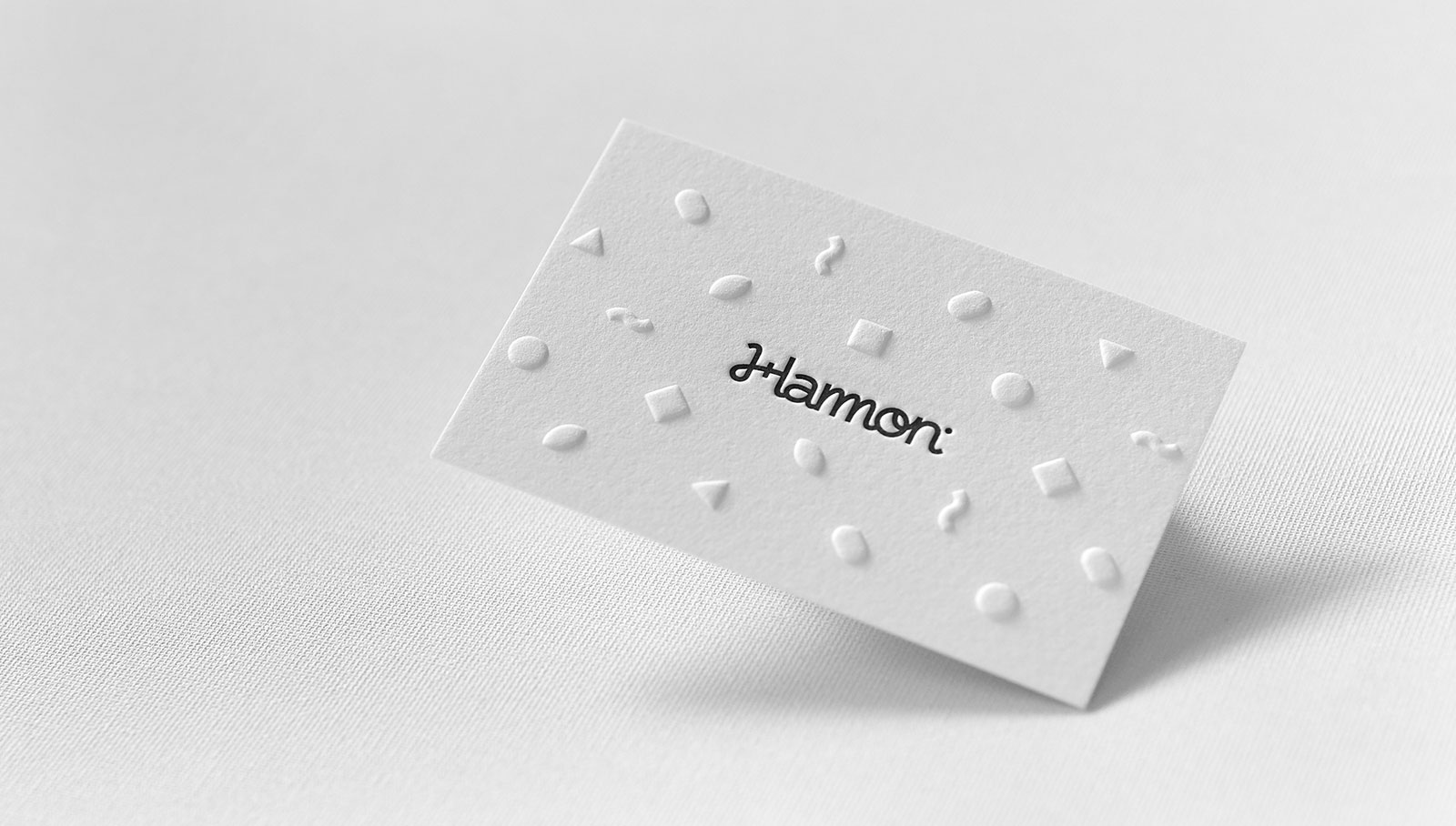

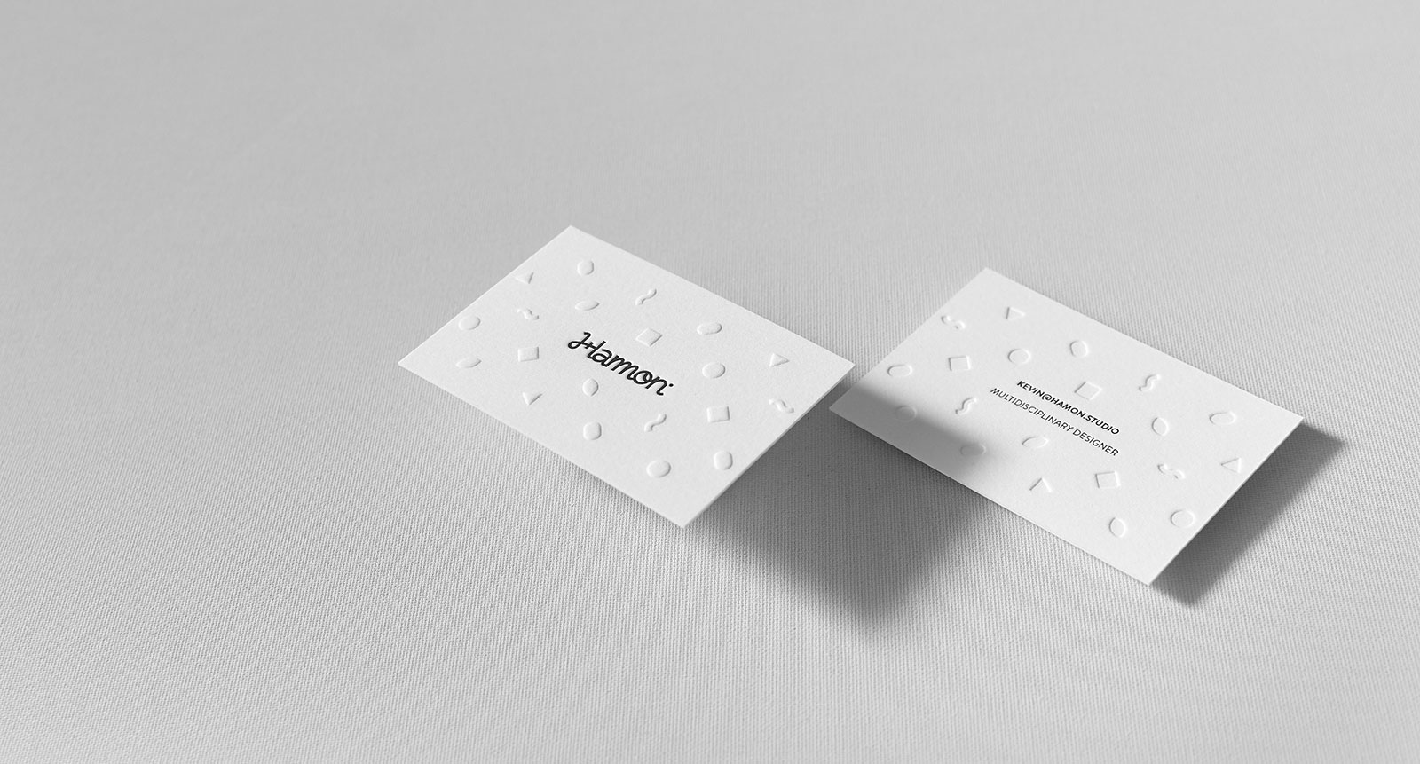
This specific business card design is a new take on dimension. With a simple overall layout, the hollows and embossing takes the design a level higher. It didn’t need the use of colors to bring about playfulness; the typographical elements and embossed feature brought that subdued personality and character.
Habib Perfume Branding and Art Direction


The Habib Perfume business card incorporates texture with their use of paper material. Which goes along with the lightness of the logo and typographical elements. With the use of texture allows the brand’s message to be conveyed accordingly to their potential clients and viewers of the business cards.
The complementary use of black and brown brings about sleekness and an earthly appearance. A balance of two varying characteristic to create a cohesive design and exterior.
Koji Sueyoshi Casette Tape-Inspired Business Card
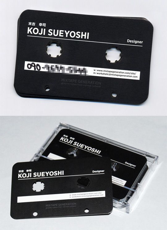
Did the previous decades call for its cassette tapes back? Maybe it didn’t since there is a resurgence of cassette tapes, a subject of visuals and design nowadays. Going by the theme of mixtape generation (as well as its domain name) represents an old-school style brought back for the modern generation. Koji Sueyoshi, as presented in the business card, is a graphic designer. With this type of creative direction best represents his brand and personality.
Katsy Garcia Personal Branding

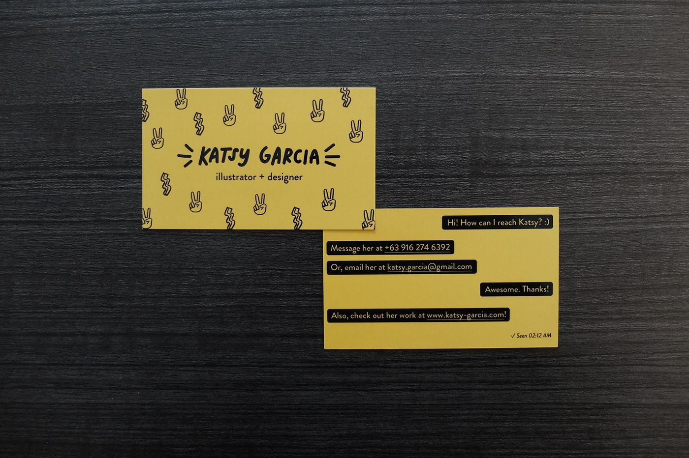
A quirky and playful take on business card designs. Set in a bright pop of yellow that immediately brings attention to viewers or potential prospects. The main focus of this business card design is its personal and approachable method of transactions or communication toward a client. The compact medium is set to look like a chat box, as if the client and the provider are conversing for contact details.
For an extensive selection for business cards, we have gathered a list of business card mockups. Whether it be for branding projects, design presentations, prototyping, and so on.
James A.W Mahon Divorce Lawyer Perforated Business Card
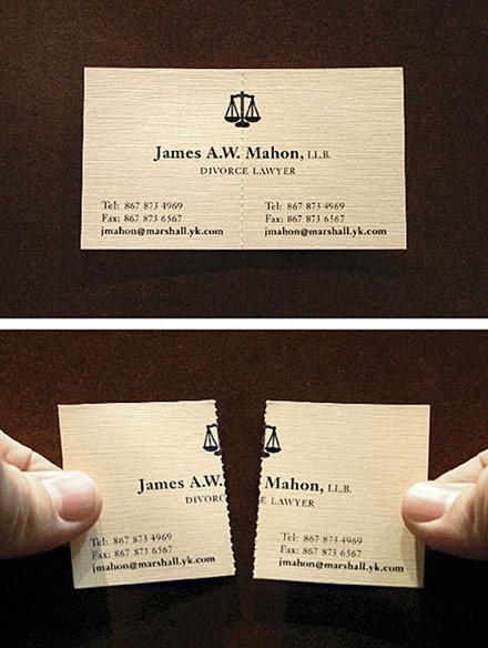
This specific business card is simple and offers a fuss free layout for the technical elements such as the logo placement and contact information. With a great concept behind it, don’t fret over the splitting perforated feature. The contact details are placed on both sides so when it has been torn up, you still get to contact the services.
Business Cards as a Reminder
Let’s face it. We have business cards made because we tend to forget things. Its presence and content reminds us of who to contact in case of any personal or business needs. So, to provide your services, talents, and skills to someone who badly needs it, don’t leave any essentials behind. The mandatory elements needed for every business cards are the brand’s logo and the contact information.
But take the advantage of what this compact medium can do. Do place any necessary social media or portfolio based sites on your business card. This increases the frequency of your sites to be reached by your potential clients and target audiences. At this point, your business card will serve as a one-stop to reach you and view your works. Who knows, your client might recommend you the next time when your service is needed.
Speaking of social media sites, you need to have a cohesive design and presentable exterior once you put in your call to action to your business cards. To help you get by, we have gathered a heap of social media icons that will be of great use to the given agenda. You may apply these icons for design projects be it for branding and advertising collateral, and especially Web design.
Tell Me More
With all these examples, there are also common mistakes you must avoid when designing your business card. This is a professional branding collateral after all. Aside from the grammatical or spelling errors, make sure to have a high-quality paper material and the appropriate use of brand design elements.
Related Posts
8+ Wooden Business Cards
Business Card: Common Mistakes You Should Avoid
9+ Square Business Cards
9+ Plastic Business Cards
10+ Real Estate Business Cards
21+ Free Printable Business Cards
8+ Business Holiday Cards
10+ Free PSD Letterhead Mockups
22+ Donation Card Designs
Free PSD Elegant Business Card Mockups
Cards
10+ ID Card Mockups
20+ Name Card Designs
18+ ID Card Designs
20+ Membership Card Designs
