Business cards ensure a measured response from potential clients and prospects. With its minuscule size, the content and design can make or break a business card. Imagine being handed out a business card and let’s say you are unable to go through it due to inappropriate use of font or probably spacing. That is just one scenario one might experience but on a broader scale, there are common blunders to you may have blindly applied.
Down below, we have gathered nine common mistakes when designing business cards as well as impressive business card designs for creative inspiration and design reference. If you haven’t checked it out, you may go through our list of business card mock-ups fit for design presentations and prototypes.
Business cards and its importance in the digital age.
Call to action. Upon meeting a client or potential prospects, handing out a business card serves as an effective medium for direct communication. Whether the transaction will involve business, political or as reference,
A visual representation of your brand or company. Business cards are an essential branding collateral and must be treated with quality and proper representation. Your brand design will reflect in this printed medium
Faster production. While the digital medium is sought after in terms of research and communication, presenting a hard copy is
7 Common Blunders You Should Avoid.
Omitting personal or professional position. In some cases, we tend to forget things and information. People need to know what you do and what you may offer. Incorporating your position be it in a personal or professional level serves as a reminder to recipients. Examples of personal and professional positions are as follows: “Justine Coady, Producer + Branding Manager” or “Roxy Andrews, “Registered Nutritionist Dietician”.
Inconsistent brand application. Applying inconsistent branding may cause confusion with what the brand offers and how your potential target market may imply of your brand.
To avoid such misunderstanding, an easy solution would be to apply the same color palettes, logo or logo variations, typography and so on the way you incorporated them across your branding collaterals and applications.
Using light colors. In terms of the branding process, it helps to have an established color palette ahead to ensure accuracy and proper branding application across all branding collaterals. If you happen to be stuck in your color selection, getting in the know regarding color theory specifically complementary colors would ease up such difficulty.
Inappropriate use of fonts. Utilization of delicate scripts and light or fine fonts might result to unreadable text unless designed properly. On important text such as contact information, make sure to use fonts that offer readability as well as its leading and kerning.
To avoid confusion, leading is the distance between lines of type while kerning is the spacing in between characters. If you are using Illustrator, simply adjust both on the software character window.
Similar with the use of light colors directly above, application of fonts should be referred through brand guides for proper implementation of the brand design across all branding collaterals.
Having poor grammar and spelling. If you are to include your brand’s tagline as well brand promise, keep in mind to check the technical elements of your business card. Be it grammar and spelling since the core of business cards is to pursue a measured response.
is a given when you add your brand’s tagline and more importantly brand promise if you p
Using sub-standard paper quality. Neat and professional presentation is key in designing and handing out business cards. Do invest in high-quality paper materials to ensure long term usage as well as to avoid smudges with the inks.
Oversized Business cards. Business cards are compact in design to match its practicality be it to be placed in a wallet or purse for immediate usage. As much as possible, stick to the standard size dimensions 3.5×2 in and if you’re feeling a little extra, you may consider crafting folded business cards.
Examples of Business Card Designs.
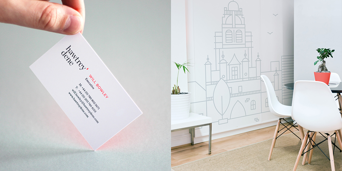
Hawtrey Dene Business Card and Personal Branding
Visit Hawtrey's Personal Branding
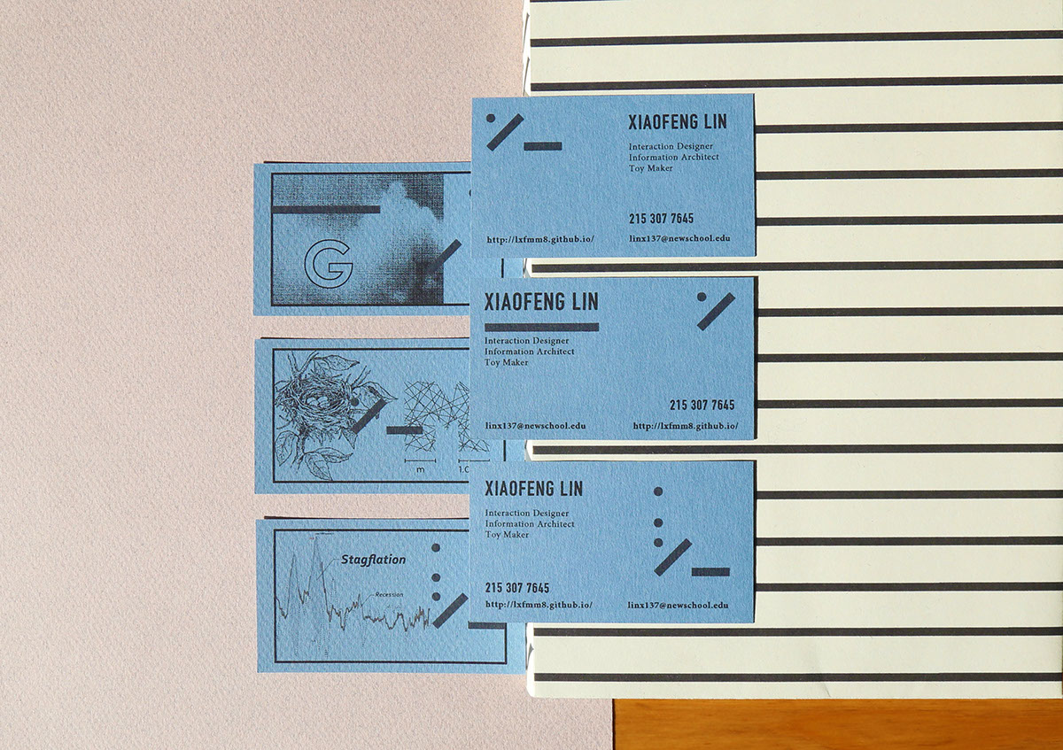
Xiaofen Lin Self-Branding & Branding Collaterals
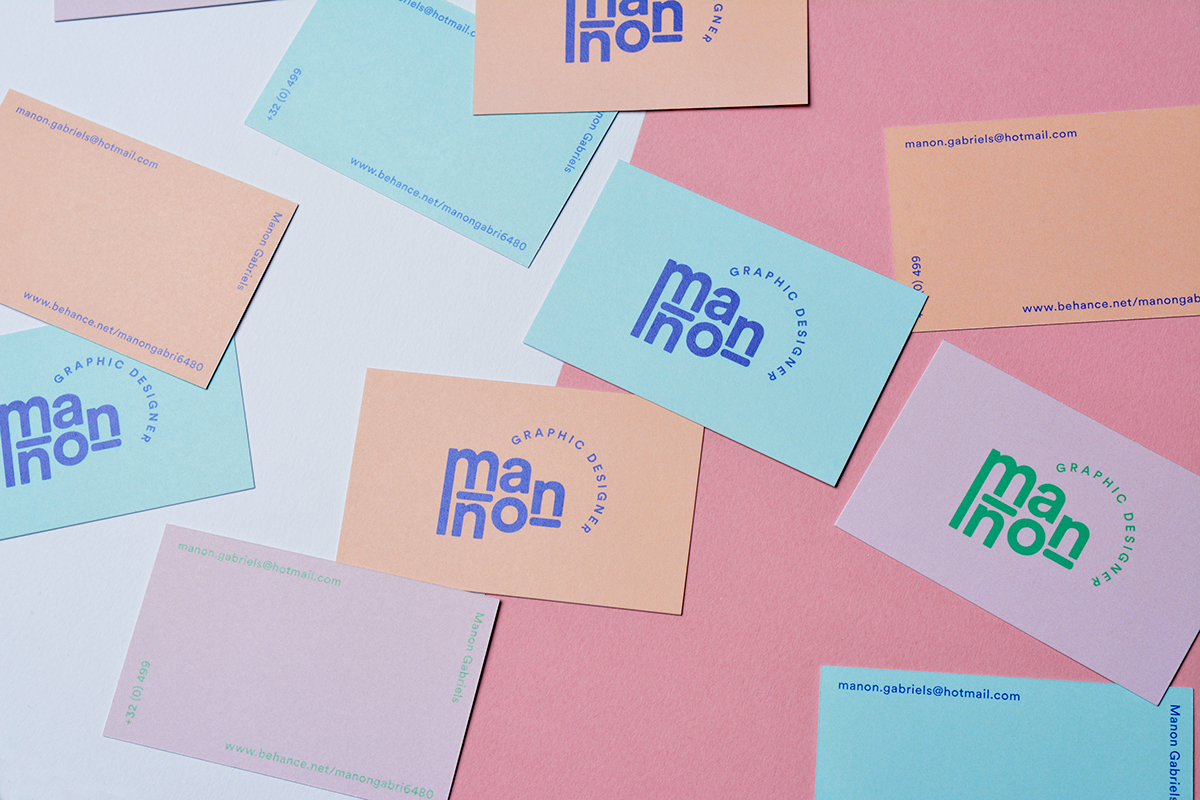
Manon Gabriels Business Cards, Portfolio & Personal Branding
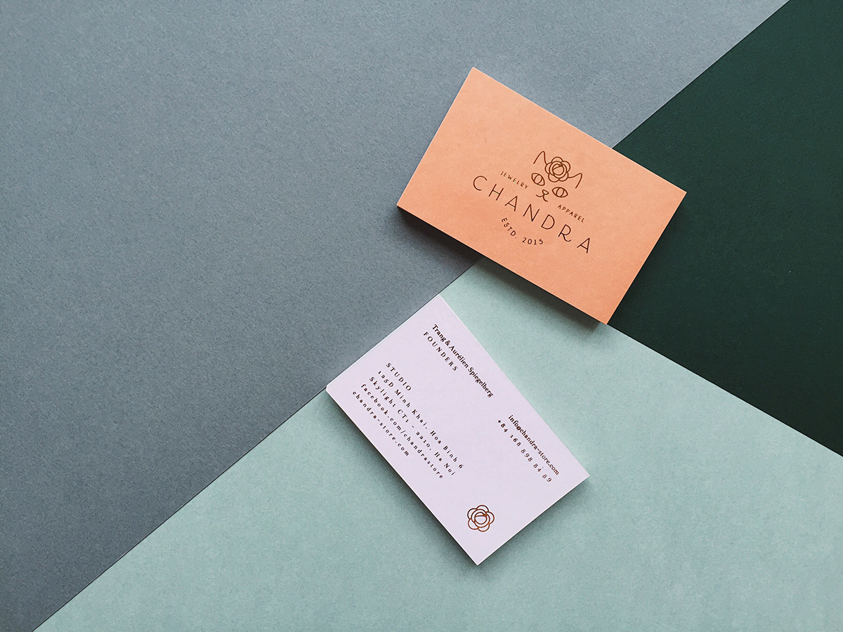
Chandra Personal Branding & Packaging Applications
Visit Chandra's Personal Branding
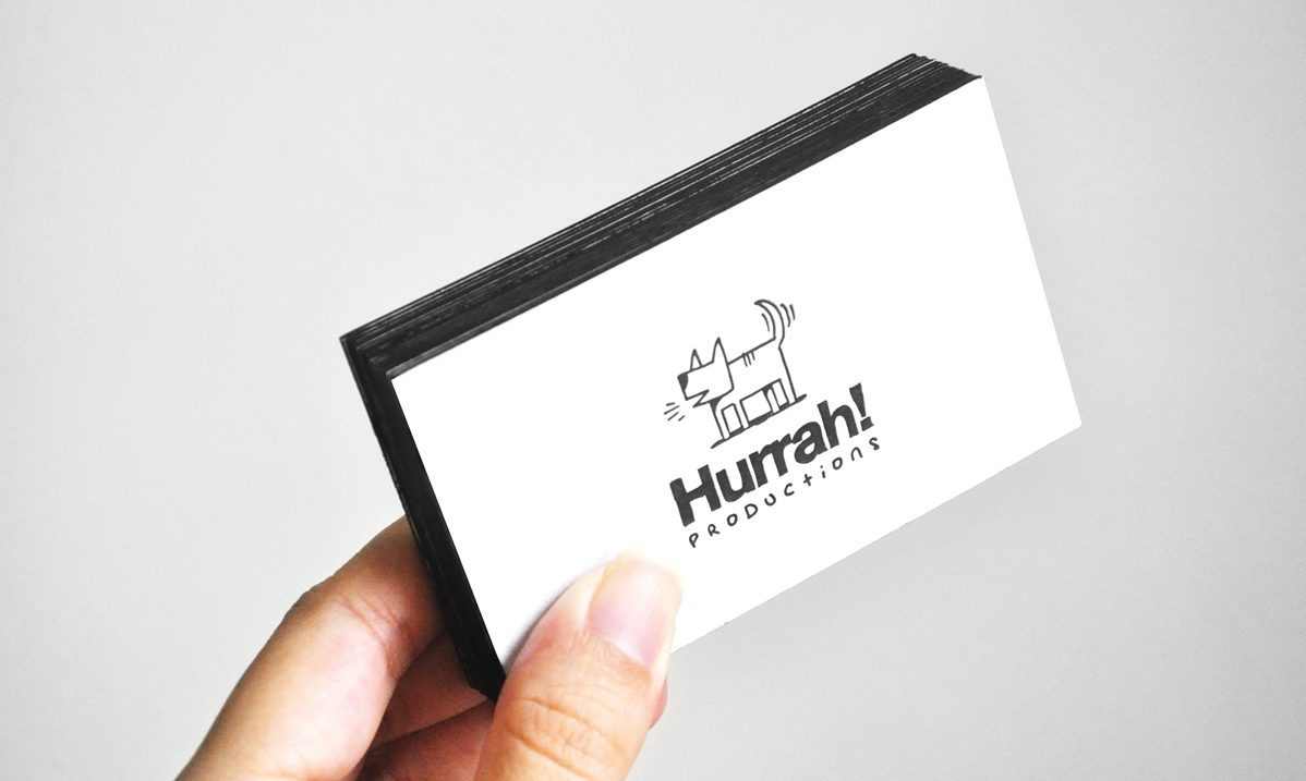
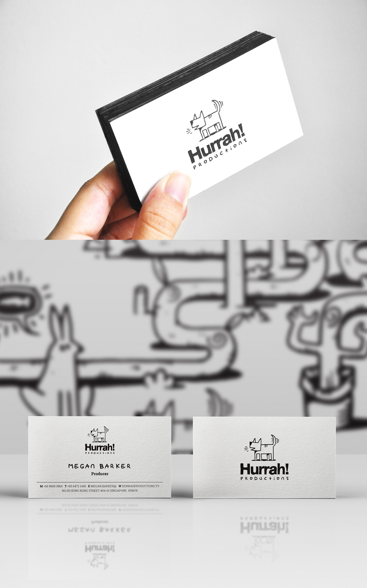
Hurrah! Letterpress Black Edge Business Card Design
Let’s call it a day.
As mentioned above that business cards are included in a line up of branding collaterals. To make sure not to leave any elements and details out of your business card, you may refer to our guide on business card ideas which includes card design examples, technical and design process. Hope this was of great help for your branding and in crafting your business card.
Related Posts
FREE 17+ Christmas Photo Cards in PSD | AI
FREE 24+ Corporate Business Card Designs in PSD | Vector EPS
5+ Dad Bod Greeting Cards for Father’s Day
FREE 19+ Birthday Cards in PSD | AI
FREE 18+ Best Card Designs in PSD | AI | InDesign | Pages
FREE 10+ Printable Thank You Cards in PSD | AI | Vector EPS
FREE 21+ Thank You Cards in PSD | Vector EPS
FREE 16+ Thank You Cards in PSD | Vector EPS
FREE 18+ Best Funeral Card Designs in PSD | Vector EPS | AI | MS Word | Apple Pages | Publisher
FREE 18+ Funny Birthday Cards in PSD | AI
FREE 18+ Funny Christmas Cards in PSD | AI
FREE 33+ Gift Cards & Vouchers Design Ideas in PSD | AI | MS Word
FREE 23+ Greeting Card Design in AI | PSD | MS Word | Apple Pages | Publisher
FREE 18+ Greeting Cards in PSD | Vector EPS
FREE 9+ Personalized Christmas Cards in PSD | AI
